Welcome!
The case study will take you through the steps involved in creating a visual identity for a ribbon printing company. This project upgraded the brand identity of an established Coventry-based business, showing every step and consideration taken into account in order to present a cohesive brand identity.

The client wanted to have an updated visual identity for their brand to bring it into the 21st century, reflecting their brand and making them stand out in their highly competitive market.
The goal was to design a logo and website that evokes prestige and achievement befitting a ribbon company launched in 1985. This was a great opportunity for applying my expertise in graphic design here in Coventry.
The process
Research and Discovery
I initially started by conducting some in-depth research in the industry, competitors, and current design trends to ensure that this new logo would resonate with the target audience. This consisted of the following:
- Understanding the Client’s Vision and Values: Discussion with the client to understand his vision and what he wants the logo to say.
- Researching the Competitor’s Visual Identity: A look into what other companies in the space were doing in order to find a gap/opportunity.
- Isolating Key Design Elements: Pinpoint elements that symbolize excellence and achievement.
Through this process, I came to understand the incorporation of elements that capture both tradition and innovation. It was, as previously mentioned, important to come up with a logo that would stand the test of time.
Concept Development
I made several logo concepts that wrapped it all up into what the brand stood for. I also designed it to be timeless and versatile enough for all sorts of applications.
- Preliminary Sketches: Drawing ideas by hand to explore different visual directions.
- Digital Renderings: Refining the selected sketches digitally to further develop the ideas.
- Client Feedback: Presenting the concepts to the client to provide feedback and revisions.
This was achieved through various brainstorming sessions of reflection on my experiences and those elements unique to the graphic design in Coventry to come up with a design that would resonate with the local market.
Design Refinement
Following the selection of the best concept, I refined the design so that all the needs of the client could be met and fit within their brand identity.
- Typography: selecting fonts to compliment the logo and enhancing readability.
- Color Palette: Creating the color palette to invoke feelings of trust, reliability, and excellence.
- Final Adjustments: Tweaking the design elements to achieve the optimal weight and balance.
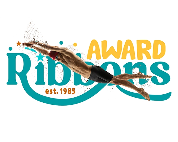
The Final Logo Design
The final logo design incorporated both classic and modern elements to represent nothing but a long-standing tradition of a company with its forward-looking philosophy.

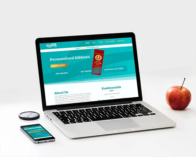
The logo was just the beginning. Along with that came the need to design an intuitive, visually appealing website to boost the online presence of the brand. This aspect of the project was paramount, as a very strong online presence is imperative in today’s day and age.
Responsive design-the site looked amazing on every device. I put in a lot of hours of testing on a variety of devices, so whomever or whoever can view the website with ease.
The design also needed to be easy to navigate: intuitive layout, clear calls to action-aka, making it easy to find what you’re looking for, whether it’s product information or placing an order.
Visual Appeal: From color to typography, the website was to integrate the new branding elements throughout the site by being an integrated extension of the brand.
Personal Touches
Building this website was the opportunity to modernize the brand and make sure the client’s brand identity flowed through into their online presence. I remember pulling an all-nighter in perfecting the site’s homepage, fuelled by the thought of how the client would react when they saw the final product.

Want to know about my Graphic Design retainers?
So, what is next for you? Are you ready to inject a little magic into great design in your business? Whether you want a new logo, some killer flyers, or anything in between, I’ve got you covered. Click the link below to learn more about these retainer packages.
“Fantastic service by Jack, hit the spot with what we wanted as a logo to represent our business, professional throughout the process, hopefully this is the start of a long relationship between our brand and Jack working on our future projects together.”
H. Singh - Blackbird Artisan
“Really Impressed… Gave my brand a much-needed makeover with a professional and affordable logo. Really quick turnaround too. Highly Recommend.”
Nick - Lifestyle Revamp
“An insightful experience. Jack took me from not knowing what I wanted, to having a brand identity which really resonates with my business vision. I could not recommend highly enough.”
Carla - Blackbird Artisan
“From start to finish Jack and his team brought our vision and brand to life. Just from the logo design alone we have brought in £1000s of revenue. Thanks guys, great job.”

