Logo Design Coventry: Street Food Brand Identity Case Study

A bold logo and brand identity system created for a West Midlands street food business, built to work across signage, packaging, menus, social media and real-world brand touchpoints.

Looking for logo design in Coventry?

If you’re a Coventry or West Midlands business looking for a logo that feels more professional, distinctive and usable, this case study shows how I approach brand identity work.

The goal is not just to create a nice-looking logo. It’s to build a visual system that works across the places your business actually shows up from websites and signage to packaging, print, social content and day-to-day marketing.

This case study explores the brand identity design process behind a growing street food business that needed a bold, recognisable logo system to stand out in a competitive market.

Rather than chasing trends, the goal was to create a flexible identity that worked across packaging, signage, clothing and digital platforms the kind of real-world usage every strong logo design project needs to consider.

Person holding a cardboard food packaging with a detailed paisley pattern and the logo of a street food company printed on it.

The midlands, A Culinary Canvas

The Midlands food scene is packed with creativity, culture and competition. For any food business trying to stand out, the logo needs to work harder than simply looking good. It has to be recognisable, memorable and flexible enough to carry the brand across every customer touchpoint.

The Spark of Inspiration

The brand needed to go beyond trends. It had to feel handcrafted, grounded in quality and flexible enough to work across everything from van wraps and signage to menus, packaging and social media. That’s where the creative direction started.

The Stylescapes

Before moving into logo design, I use stylescapes to define the visual direction of the brand. These are focused moodboards made up of colours, typography, imagery and design references that help shape the overall identity.

For this project, the stylescapes helped narrow the direction before any final logo concepts were developed. It meant the finished identity had a clear visual foundation instead of being based on guesswork.

These were the three creative routes explored:

Heritage Flavours

Coventry Logo Design for a street food business

Gourmet Blend

Coventry Logo Design for a street food business

Urban Spice

Coventry Logo Design for a street food business

Creating a Scalable Logo System

The Primary Logo: Where Tradition Meets Modernity

The primary logo needed to balance tradition with a more modern street food feel. A bold serif gave the identity a sense of heritage and confidence, while the cleaner sans-serif lettering helped keep it approachable, casual and easier to use across everyday brand materials.

Close-up of a logo printed on a brown paper bag, featuring an oval design with a stylised deer head and antlers, and the text 'STREET FOOD' below the logo, all in a distressed black print.

Fun Fact!

Integrating the blackbuck deer head between the words was like finding the missing piece of a jigsaw puzzle. It wasn’t just a design element; it was a nod to the grace of the blackbuck and the seamless blend of Asian and Western culinary traditions as the blackbuck is the state animal of punjab.

Alternative Logo Layouts for Real-World Use

Versatility is Key

Flexibility is essential for any food brand. The logo needs to work on a wide sign, a small sticker, a social media profile, a menu, a van wrap and a piece of packaging without losing recognition.

That’s why the identity included alternative logo layouts, light and dark versions, and simplified marks that could adapt to different spaces while still feeling consistent.

Logo featuring bold, uppercase letters on a white background within an oval border that points up, with a stylised image of a deer's head and antlers centred above the text, which reads 'STREET FOOD'.
Logo featuring bold, uppercase letters on a white background within an oval border that points down, with a stylised image of a deer's head and antlers centred above the text, which reads 'STREET FOOD'.
Logo featuring bold, uppercase letters on a white background within an oval border that points left , with a stylised image of a deer's head and antlers centred above the text, which reads 'STREET FOOD'.
Logo featuring bold, uppercase letters on a white background within an oval border that points right , with a stylised image of a deer's head and antlers centred above the text, which reads 'STREET FOOD'.
Logo featuring bold, uppercase letters on a black background within an oval border that points up , with a stylised image of a deer's head and antlers centred above the text, which reads 'STREET FOOD'.
Logo featuring bold, uppercase letters on a black background within an oval border that points down, with a stylised image of a deer's head and antlers centred above the text, which reads 'STREET FOOD'.
Logo featuring bold, uppercase letters on a black background within an oval border that points left , with a stylised image of a deer's head and antlers centred above the text, which reads 'STREET FOOD'.
Logo featuring bold, uppercase letters on a black background within an oval border that points right , with a stylised image of a deer's head and antlers centred above the text, which reads 'STREET FOOD'.

Logo Mark: Compact, Yet Impactful

The compact logo mark was designed for the moments where the full logo would be too wide or too detailed. By placing the deer head inside a rugged circular badge, the brand had a recognisable icon that could work on stickers, social media profiles, packaging seals and smaller print applications.

Looking for logo design in Coventry or the wider West Midlands? View my logo design packages.


Street food business logo design in coventry

Technicalities Matter: Scalability, Spacing and Usability

Scalability: Making Sure You're Seen

A logo that disappears when it’s small is not doing its job. Scalability was a key part of this logo design process, making sure the identity stayed clear whether it appeared as a social media profile image, packaging mark, menu graphic or large-format sign.

Pro Tip!

A good logo should be tested before it is signed off. Check it small, large, light, dark, printed, digital and in the awkward spaces it will actually need to live.

Brand Pattern and Supporting Assets

The supporting brand pattern gave the identity more depth beyond the logo itself. Inspired by the deer head, key ingredients and paisley-style detailing, the pattern created a flexible visual asset for packaging, print, social media and branded materials.

This is where a logo project starts to become a fuller brand identity system: not just one mark, but a set of elements that make the business feel more consistent and recognisable.

Final Thoughts: What This Coventry Logo Design Project Shows

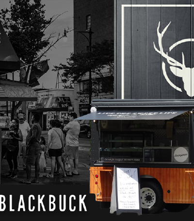
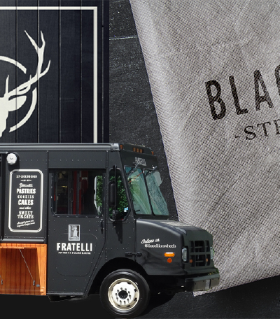
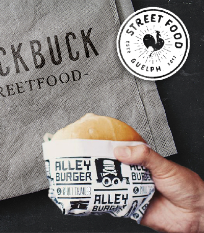
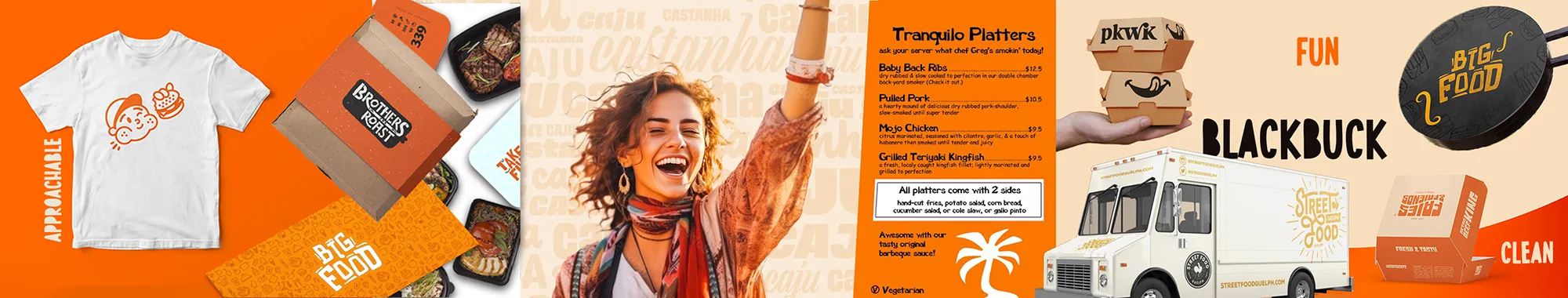
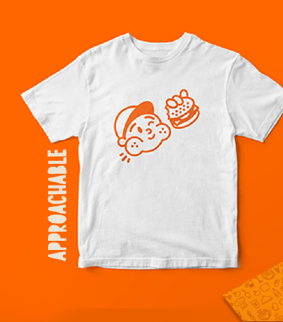
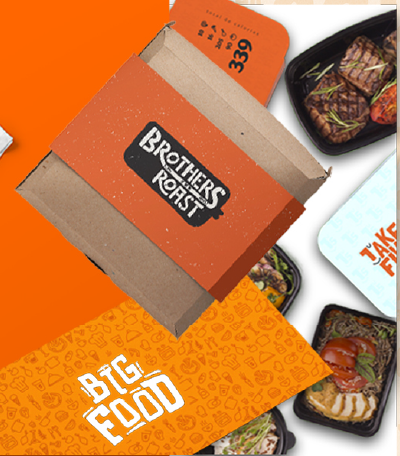
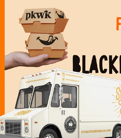
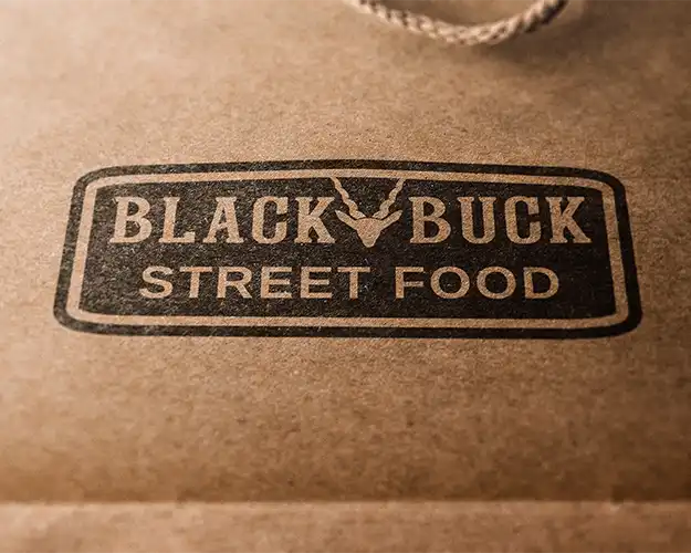
This project shows how a logo can become more than a single graphic. With the right creative direction, alternative layouts, compact marks and supporting brand assets, a business can build an identity that feels consistent across every customer touchpoint.

For Coventry and West Midlands businesses, that matters. Your logo has to work on websites, signage, packaging, social media, uniforms, print and all the small details people notice before they ever make an enquiry.

If your current logo feels rushed, dated or difficult to use, this is the level of thinking I bring to logo design and brand identity projects.

Logo Design Feedback

“Fantastic service by Jack, hit the spot with what we wanted as a logo to represent our business, professional throughout the process, hopefully this is the start of a long relationship between our brand and Jack working on our future projects together.”

H. Singh - Blackbuck Street Food

“Really Impressed… Gave my brand a much-needed makeover with a professional and affordable logo. Really quick turnaround too. Highly Recommend.”

Nick - Lifestyle Revamp

“An insightful experience. Jack took me from not knowing what I wanted, to having a brand identity which really resonates with my business vision. I could not recommend highly enough.”

Carla - Blackbird Artisan

“From start to finish Jack and his team brought our vision and brand to life. Just from the logo design alone we have brought in £1000s of revenue. Thanks guys, great job.”

Troy - Done For You Sales Agency

Want a logo that works this hard for your business?

FAQ's

Wondering about my process, pricing details, or project timelines?

Here are some frequently asked questions to address any queries you might have.

Wanna be kept up to date? Follow me:

My logo design projects usually start from £350 and scale depending on complexity, number of deliverables, and whether you’re looking for a full identity system. For more info, check out my logo design proposal.

For most Midlands-based clients, logo design projects take 2-4 weeks from brief to final delivery allowing for concept development, feedback, and finalisation.

Yes I regularly work with brands in the West Midlands and uk, both in-person and remotely. I also offer in-person meetings for local projects.

Every project is different, but packages often include logo variations, icon mark, colour palette, typography system, and brand guidelines everything you need to launch with confidence.

Absolutely. I’m based nearby and regularly meet clients in Midlands. Just drop me a message to book something in.

Not at all. This page shows a street food brand identity case study, but I work with a range of businesses, including trades, clothing brands, ecommerce shops, event companies, service providers and independent start-ups.