
Adaptive Typography
How AI Could Change the Way We Use Type

Freelance Graphic Designer, UK
A recent Monotype report, “Re:Vision 2025,” explores a future where fonts aren’t just chosen, they adapt. Think typefaces that change weight based on your ambient light, shift kerning when reading speed increases, or evolve based on where you’re looking theverge.com.
This is more than theoretical. Today’s AI tools can already suggest kerning optimisations or identify typefaces from images. But the new frontier is dynamic: typography as a living layer in the user experience.
🚀 Why It Matters for Designers
- Brand as Behavioural System
Brands rely heavily on type. Making that type adaptive means your voice is always optimised to context—be it dark-mode emails or mobile-first reading. It elevates brand expression into behaviour, not decoration. - Democratising Design
These systems can empower non-designers to maintain visual quality. Machine-adjusted kerning or contrast means fewer mistakes and better consistency across large teams—even without a designer on every channel. - Creative vs Control
Some design veterans worry that handing over nuance to algorithms risks losing the subtle decisions that define signature styles. The challenge is building tools that enhance craftsmanship, not replace it.
🛠️ How to Prepare
- Start Small: Begin with responsive type features—colour, weight or spacing based on basic triggers (time, mode, backlight).
- Prototype Interactively: Tools like variable fonts and CSS animation help simulate adaptive type. Test flow, readability and emotional tone.
- Document Instructions: For each adaptive variable, define brand rules. When should weight shift? Where is contrast essential?
- Monitor Real Use: Roll out adaptive type internally first. Gather feedback on readability, brand perception and system reliability.
✅ Attention Points
- Accessibility: Be careful – low-contrast environments can clash with adaptive styles. Test rigorously.
- Fallbacks: Not all platforms support dynamic fonts. Ensure static versions align closely with the adaptive design.
- Ethical Design: Resist letting AI run wild. The system should respect intent – manually curated, not just data-driven.
🌐 The Big Picture
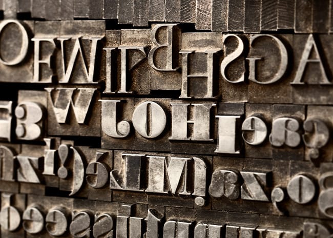
Typography has been evolving since the Gutenberg press. Now we’re at another pivot point – fonts that respond to human context. Monotype’s vision isn’t perfect, and implementation gaps remain . But it points a new direction: type as part of a living brand system.
For identity designers, this is a chance to redefine what “consistent” means. Brands don’t just speak, they behave. And in that behaviour lies the difference between a static logo and a living identity.