
How to Align Your Brand Design to the Values of Your Company
Your brand is so much more than a pretty logo and tagline: it’s a virtual handshake to the world showing that your company exists. When done right, it captures everything from your values to your mission where it says, “This is why we do it.” So the question is, just exactly how can this be ensured-that your brand values and the design match? Let’s outline several practical methods aimed at combining your brand’s look with its values and how the result is most important to every business today.
Why Your Values Are the North Star
Your company’s values are a compass guiding everything you do. They should inform how you treat customers, how you develop products, and yes-how your brand looks and feels. Misaligned branding sends mixed signals, leaving people confused or uninterested.
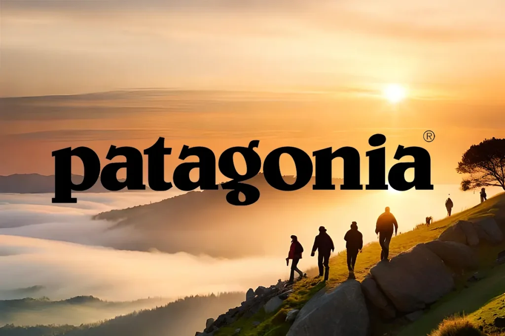
The bottom line is, people don’t buy products; they buy into what you stand for. Take Patagonia as an example: the rugged, minimalist design speaks to its commitment to sustainability and the outdoors. Every touchpoint screams, “We care about the planet.”.
Unless you crystal clear about the value of your company, then this is what you need to be doing. Note down on a paper in points or short phases what your brand is. Try being as precise as possible. Some examples might be: Innovation, Community, or Adventure. Your designs should visualise exactly what you write down on that paper
Basic Foundations: Colours, Fonts, Imagery
Brand design is a language, and your audience speaks fluent first impressions. Colours, fonts, and visuals would all have told a story about who you are before you had even uttered a word.
Colours: The Emotional Powerhouse
Colours aren’t just pretty, they’re psychological. Warm tones, like orange and red, make people feel things-like energy and passion. Blues and greens strike a cool tone and feel calming and trustworthy. If your company is creative, bold colors make complete sense. If your vibe is professional and grounded, neutrals may just be your best bet.
For example, when I was working with a tiny nonprofit focused on environmental education, the clients requested the brand feel friendly and optimistic. We went soft green and blues, mingling with earthly beiges-the result, a palette as anchored as its mission.
Fonts: Personality in Print
Fonts describe how people should feel about your brand. A clean, sans-serif font like Helvetica says “modern and minimalist,” while a playful script shouts “fun and approachable.” Choose a font-or font pair-that reinforces your vibe.
Imagery: Show, Don't Tell
Photography, illustration, and patterns can either amplify your message or confuse it. If authenticity is one of your core values, use real, unfiltered photos instead of overtly staged stock images.
Pro tip: make a mood board. It’s just an extremely low-pressure way to see how different elements play together.
Use the Same Look and Feel Across Every Touchpoint
A killer website or gorgeous logo aren’t what makes for a great brand; Instead, it’s all in the consistency of every touchpoint from your Instagram feed to the signature on your email: cohesive in appearance and feel.
Here’s why: consistency breeds trust. If your website screams “adventure” but your packaging whispers “monotomy”, you’re creating a disconnect. That gap can cost you credibility.
Quick fix: Audit your brand assets. Does everything-from your logo to your social media graphics-feel unified? If not, it’s time for a refresh.
Infuse Your Story into Your Brand
Storytelling makes your brand human. People connect with stories, not sterile marketing. Give your design some of the elements in your journey.
Example: Some time ago, I worked with a coffee roaster that started their business in a garage, literally, with one hand-me-down espresso machine. We wove that scrappy origin story into their packaging with hand-drawn sketches of the garage and bold typography to evoke the industrial vibe. It resonated deeply with their audience because it felt real.
Ask yourself, what’s weird about your story and how do you bring it into the animation?
When in Doubt, Call in the Pros
It’s overwhelming to align your brand design with your values, especially if design isn’t your big wheel. That’s where I come in: Having helped brands for years create visuals that really feel representative of their mission, I’m happy to help you cut through the noise and create something that feels just right.
Let’s work together to tell your story through design. Whether it’s a full rebrand or just a couple of tweaks to sharpen the look, I’m here to make this process seamless-say the least, fun.
Get in touch with me today and let’s get your brand looking as good as it feels.
Final Thoughts
As we said at the start, your brand is the visual handshake that sets the tone for how people perceive your company. By aligning your design with your values, you’re not just creating something pretty—you’re building trust, telling your story, and connecting with your audience on a deeper level.
So, what’s your brand saying about you right now? If that isn’t you, then let’s fix that. After all, your company deserves a brand that feels just as real as the work you put into it.
Ready to make it happen? Reach out here and let’s start building up something amazing together.
For more insights on enhancing your brand’s identity and creating impactful design solutions, stay tuned to my blog or contact me directly. Let’s work together to elevate your brand to new heights!
The Creative Compass Bulletin is your monthly guide to navigating the world of design. Packed with inspiration, expert tips, and exclusive resources, it’s crafted specifically for freelance designers who are ready to level up their creative game and grow their brand. Join a community of like-minded creatives and let the Creative Compass Bulletin point you in the right direction!