Vintage Logo Design Tips for Timeless Branding

Freelance Graphic Designer, UK
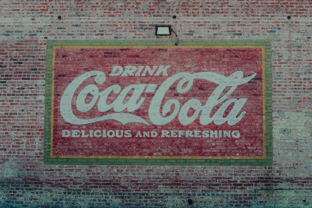
Vintage logos have a unique charm that can transport your brand back in time while still feeling relevant today. Whether you’re designing a logo for a nostalgic brand or simply want to add a touch of retro flair to your identity, here are some valuable vintage logo design tips for achieving that classic look.

Tip 1. Grasping the Era:
Before delving into the design process, it’s crucial to research and comprehend the era you want to draw inspiration from. Vintage can encompass a wide range of time periods, from the Art Deco elegance of the 1920s to the bold and vibrant styles of the 1970s. Each era has its own distinctive design elements, so immerse yourself in the aesthetics of your chosen period.

Tip 2. Choosing the perfect typography:
Typography plays a pivotal role in vintage logo design. Selecting the appropriate fonts is essential for conveying the right era and mood. For instance, serif fonts like Baskerville or Bodoni evoke a sense of classic elegance, while bold sans-serif fonts like Futura or Avant-Garde can represent a more modern vintage look.
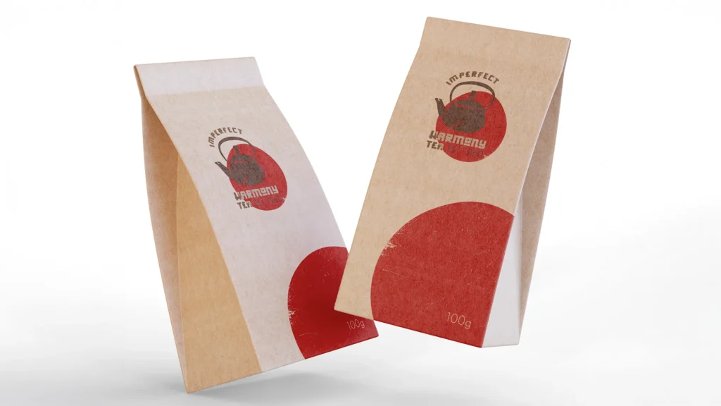
Tip 3. Embracing Distressed Textures
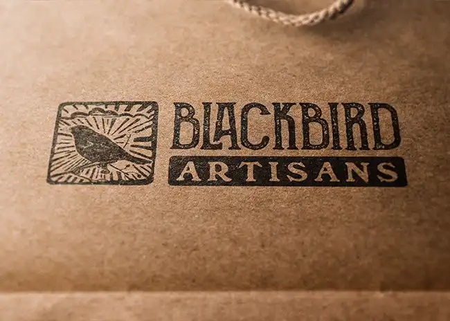
To add authenticity to your vintage logo, consider incorporating distressed textures or worn effects. These imperfections can give your design a weathered, vintage feel. Experiment with subtle grunge textures, scratches, or faded colours to achieve the desired effect.
Free
Creative Brief Template
Got ideas swirling for your logo? Don’t let them go to waste.
Download my Creative Brief Template to map out your style, vibe, and goals – so your logo comes out looking exactly how it should.

Tip 4. Adhering to a Limited Colour Palette
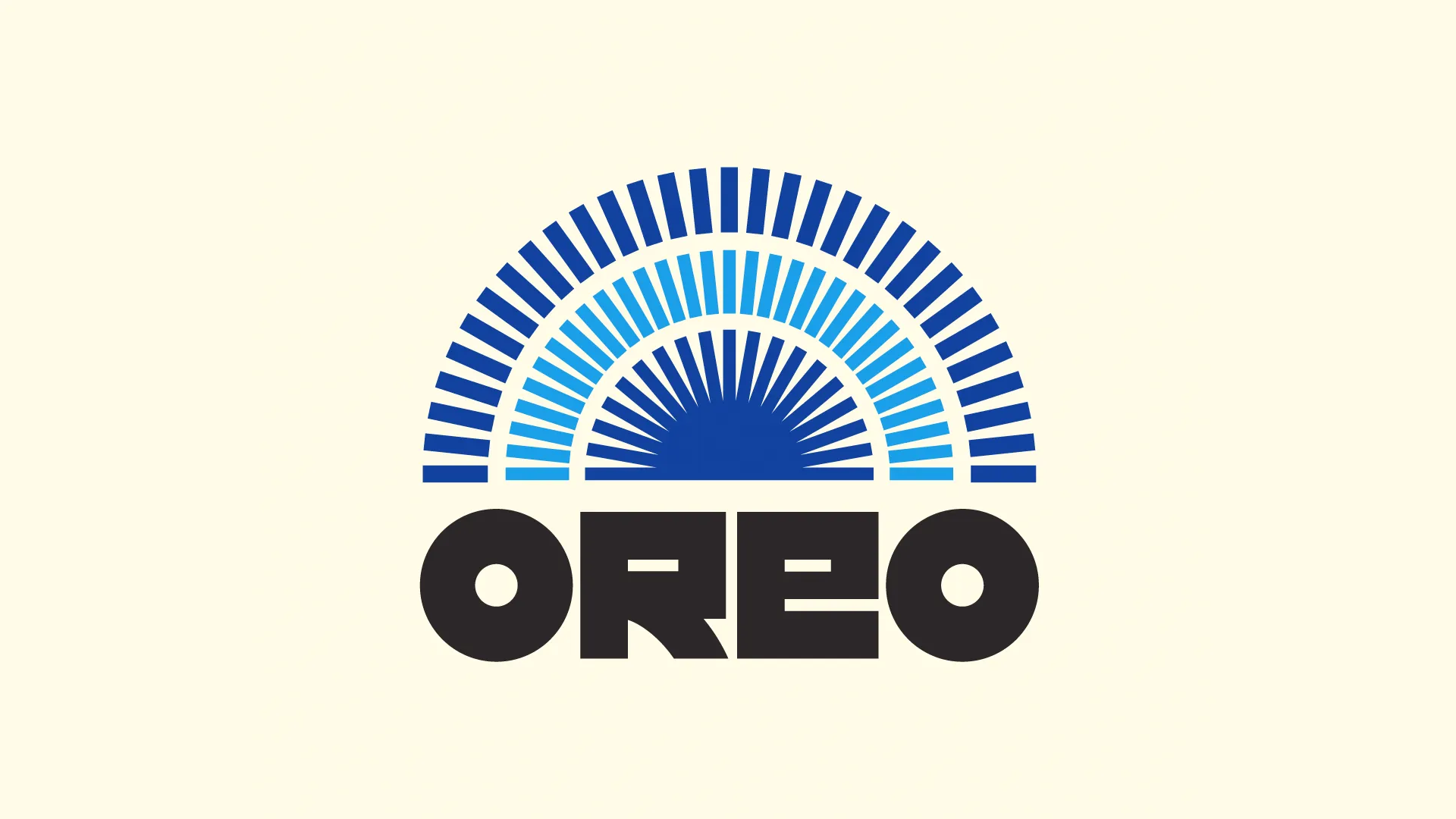
Credit – Rafael Serra (creative bloq)
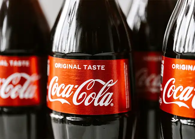
Vintage logos often feature a limited colour palette that reflects the era’s design sensibilities. Earthy tones, muted pastels, and sepia tones are commonly associated with vintage aesthetics. However, don’t be afraid to use bold, contrasting colours if they align with your chosen era.
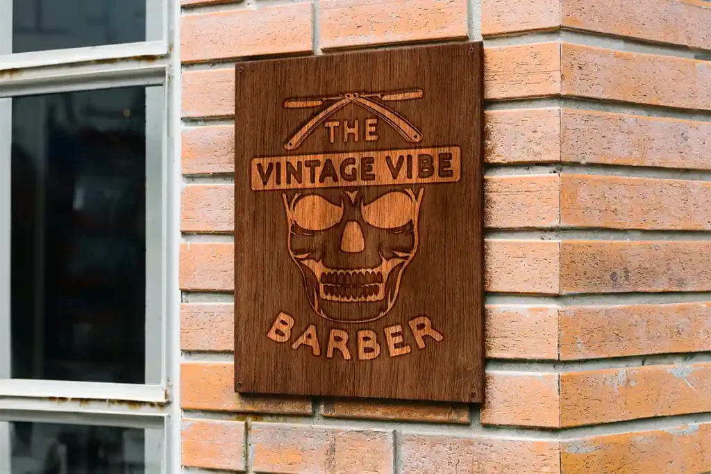
Tip 5. Crafting Unique Illustrations
Custom illustrations and icons are a hallmark of vintage logos. These illustrations should be tailored to your brand’s story and the era you’re representing. Whether it’s intricate line art or stylised symbols, these elements can add a distinctive vintage touch to your logo.

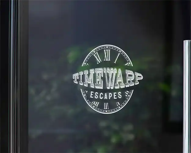
Tip 7. Aiming for Timelessness
While vintage logos are rooted in history, they should also feel relevant in the present and future. Balance nostalgia with contemporary design elements to ensure your logo stands the test of time and doesn’t become outdated.
Tip 8. Testing and Iteration
Finally, don’t forget to test your vintage logo on various platforms and in different sizes. It should look great whether it’s on a billboard or a business card. If needed, iterate on your design to fine-tune it for maximum impact.
In conclusion, vintage logo design is a timeless approach that can infuse character and personality into your brand identity. By understanding the era, choosing the right typography, embracing textures, and following these vintage logo design tips, you can create a logo that resonates with your audience and stands out in the modern world.
Remember, vintage design is all about capturing the spirit of the past while keeping an eye on the future. So, have fun exploring the aesthetics of bygone eras and let your creativity flow as you design your vintage logo masterpiece.

The Creative Compass Bulletin is your monthly guide to navigating the world of design. Packed with inspiration, expert tips, and exclusive resources, it’s crafted specifically for freelance designers who are ready to level up their creative game and grow their brand. Join a community of like-minded creatives and let the Creative Compass Bulletin point you in the right direction!

