The Client Brief
I teamed up with Stuart Alan, an ambitious estate agency based in Birmingham, to create a bold, modern logo that stands out in the local property market.
From our first conversation, we knew this project was all about crafting a Birmingham real estate logo design that felt trustworthy, approachable, and sharp enough to make a lasting impression.
The brief? Clean, distinctive typography. A fresh take on real estate branding. Something that didn’t feel copy-and-paste.

The client wanted more than just a generic property logo they were after a full brand identity that captured their personality and values. No cliché rooftops. No overused icons. Just strong, purposeful design that built instant credibility and trust with potential buyers and sellers in Birmingham.
So, my mission was clear: deliver a bespoke Birmingham real estate logo design that reflected their professionalism, warmth, and commitment to excellent service.
Initial Consultation
Getting the Vision Right
We started with a one-to-one session to explore their goals, style preferences, and the kind of message they wanted to put out into the world. The client had a clear idea of who they were but they needed help turning that into a visual identity. I then dug into competitor research, tone of voice, and the emotions behind their brand.
1. Research & Inspiration
Before jumping into design, I looked at what makes a real estate logo work especially in a competitive local market like Birmingham. I analysed colours, fonts, and layouts across dozens of agencies to identify gaps and opportunities. This step helped me shape a logo that would feel familiar but unmistakably unique.
2. Initial Concepts
Letting Creativity Flow
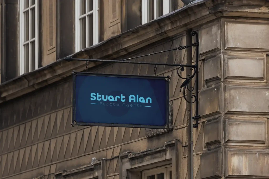
With a strong foundation, I moved into ideation. The first round of concepts explored modern typography with clean, geometric lines something timeless but with edge. One early concept caught their attention: a minimal, typographic approach that cleverly spaced the words “Stuart” and “Alan” while keeping it easy to read on signage, business cards, and online platforms.
3. The Evolving Design
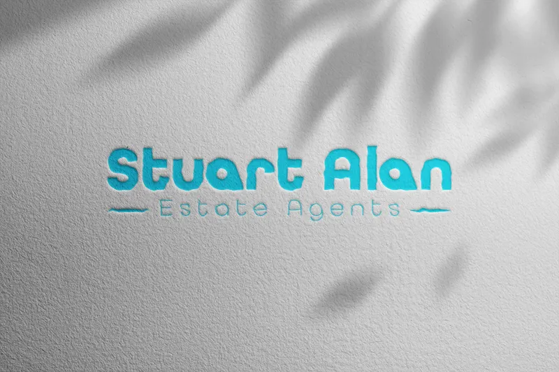
From that first concept, we refined the spacing, alignment, and colour combinations until it felt just right. The logo started to take on a personality confident, clean, and full of clarity. This wasn’t just another Birmingham real estate logo design it was something that stood apart without shouting.
Colour Choice
Bold, Bright, and Memorable
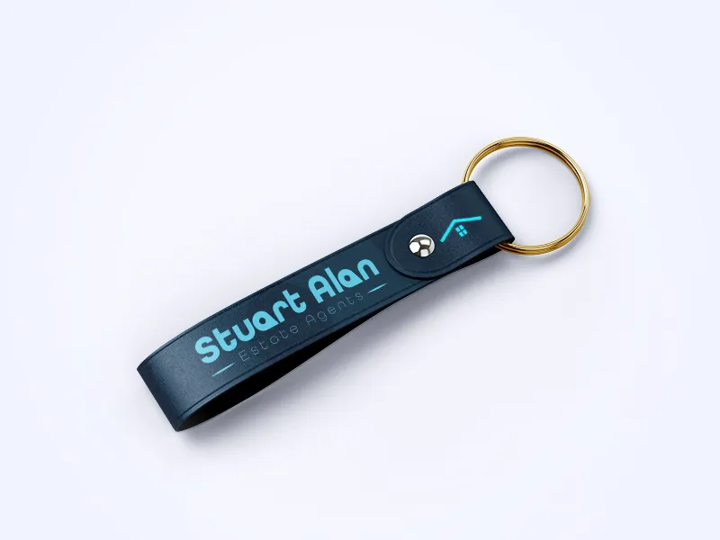
We went with a vibrant teal blue modern, energetic, and distinctive in the real estate space. It’s not just eye-catching; it also holds up well in both digital and print applications, and offers great contrast when paired with darker backdrops. This colour decision helped give the estate agents brand a refreshing, confident identity.
Smoothing Things Out
The Small Things Count
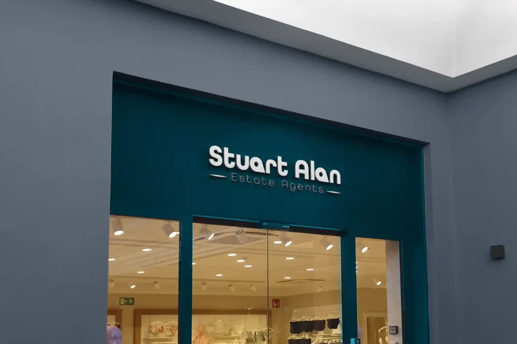
Details matter in logo design especially in real estate, where first impressions mean everything. We tightened the kerning, softened a few corners, and tested the design at small sizes to make sure it held up everywhere from a shopfront sign to a mobile screen.
The Final Birmingham Real Estate Logo Design
Bringing It All Together
The result? A clean, modern logo that reflects who the client is: a trustworthy estate agency with a strong presence in Birmingham. The final design balances professional typography with a welcoming tone, making it ideal for both local advertising and long-term brand recognition.
Final Thoughts
Creating a great Birmingham real estate logo design isn’t about fancy effects or flashy graphics. It’s about crafting a visual identity that connects with real people buyers, sellers, and landlords who want to work with someone they trust. That’s what I delivered for this estate agent, and it’s what I aim to deliver in every branding project.
Looking to build a real estate brand that stands out? Let’s chat about how we can help you level up your identity and attract the right clients.
