Welcome!
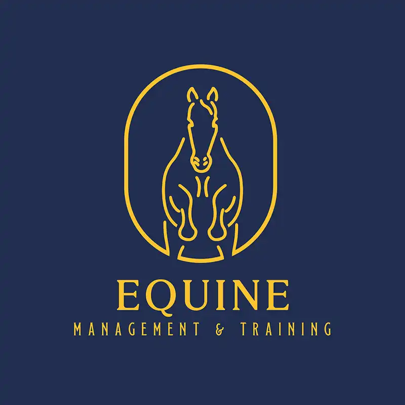
As a logo designer Stamford and uk wide businesses choose, my objective is to create a logo representative of the identity and values of each and every one of them. In this project for EMT, I had the opportunity to work on a logo that suits the needs of their business and the community of Stamford.

The client wanted something that represented their brand but also shouted for their deep connection to the world of equestrians. Being a business-based in Stamford, they needed a logo design that would command attention from potential clients through competitive means while keeping the strong, professional presence.
The Design Process
The Stamford logo design process involved first getting deep into the core values of the brand and the message it will be proclaiming. In the case of EMT, the focus was on creating a logo that exudes trust, professionalism, and a deep affinity with horses.
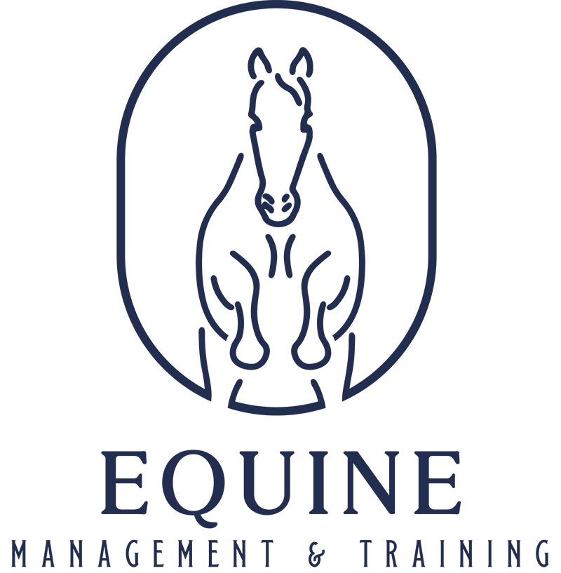
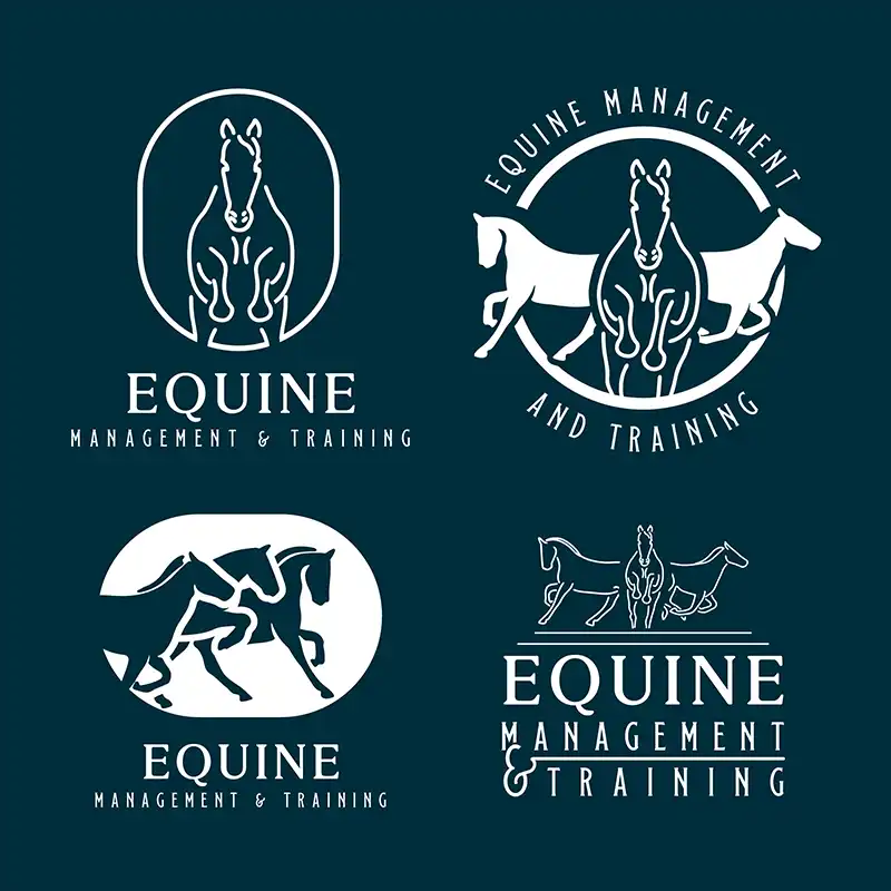
I did a lot of research into different concepts, trying to find that sweet spot between detailed illustration and modern simplicity. The end result was a refinement of classic and modern combined-using the horse’s elegance and strength, closed into a minimal frame-suggesting protection and guidance.
The colour palette used for the logo design stamford will recognise is a sophisticated navy and gold to represent the twin elements of luxury and reliability, both so essential to a brand within the equestrian market. This typography also supports the visual elements with a classic feel that would see this logo stay fresh for a number of years.
The brand guidelines
I designed a full set of brand guidelines for EMT; this ensured consistency in application of their visual identity across all platforms. These are the guidelines that regulate the use of the logo, including scale and spacing for maximum clarity and impact in different scenarios. The color palette, as previously mentioned, consists of a deep navy and vibrant gold that communicates professionalism and trust, while typography balances modernity with classic elegance. The guidelines will be of immense help in maintaining the integrity of the brand so that it’s continuously recognizable and effective in all media.
The Logo Design Stamford Results
The final logo design is a graphical representation of what EMT stands for: expertise, dedication, and passion for excellence. Impressive, too, has been the way it has been designed-equal in a variety of mediums, digital to print materials.
Nothing speaks volumes for the company than a logo to which both the client and competitors resonate. The EMT logo that I designed did just that: made a mark and positioned it in the market.

“Fantastic service by Jack, hit the spot with what we wanted as a logo to represent our business, professional throughout the process, hopefully this is the start of a long relationship between our brand and Jack working on our future projects together.”
H. Singh - Blackbird Artisan
“Really Impressed… Gave my brand a much-needed makeover with a professional and affordable logo. Really quick turnaround too. Highly Recommend.”
Nick - Lifestyle Revamp
“An insightful experience. Jack took me from not knowing what I wanted, to having a brand identity which really resonates with my business vision. I could not recommend highly enough.”
Carla - Blackbird Artisan
“From start to finish Jack and his team brought our vision and brand to life. Just from the logo design alone we have brought in £1000s of revenue. Thanks guys, great job.”
Troy - Done For You Sales Agency
FAQ's
Wondering about my process, pricing details, or project timelines?
Here are some frequently asked questions to address any queries you might have.
Wanna be kept up to date? Follow me:
Do you only offer equestrian designs?
Not at all. While I’ve had the privilege of working with a number of equine and countryside brands, my design services span a wide range of industries from coaching and consulting to street food and beyond. If you’re serious about building a standout brand, I’d love to collaborate… no matter your niche.
How long does a logo design project like this take?
Most logo design projects typically take 2–4 weeks, depending on the scope and how quickly feedback is provided. I keep the process collaborative and structured to keep things moving without cutting corners.
Can I get just a logo without the full brand identity?
Absolutely! I offer flexible packages to suit different needs and budgets. Find out more about my packages and pricing here
Do you only serve Stamford?
Nope, I work with clients all across the UK and beyond! While this particular project was based in Stamford, I’m actually based in the West Midlands and work remotely with businesses nationwide. Wherever you’re based, if we’re a good fit, we can make it happen.
What if I want to evolve my existing logo instead of a full redesign?
Absolutely possible! Whether it’s a brand refresh, a modernisation, or a clean-up of your current assets, I can approach the project in a way that preserves your legacy while elevating your look. Get in touch for a custom quote and let’s get going!
Is this logo available as a template or for reuse?
Nope, although if you’re looking for something cheap to get your business off the ground, it might be worth checking out my design shop! I’ve got a few diy templates on there using the rejected designs from some clients.
