The Brief
A Bold yet Timeless Manchester Logo Design
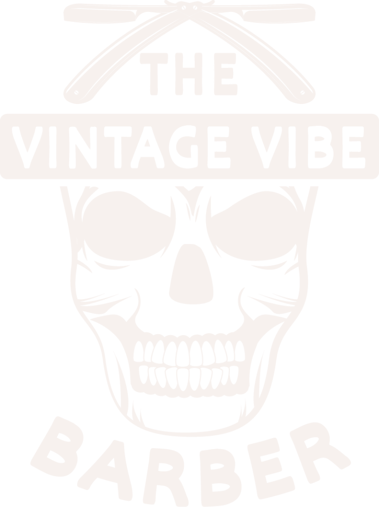
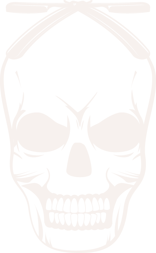
I was approached for crafting a new identity by a barbershop in Manchester, with a scheme that distinctly took center stage-wherein boldness is requested so as to showcase the essence of the classic style with a modern feel.
The shop had to be unapologetically masculine, gritty, and rooted in tradition, yet approachable and professional. This was not about doing a cool design; this was about building a brand that could stand out from a very crowded marketplace.
That is where my expertise in Rustic logo design came in.
First, I had to get an idea of what set their barbershop apart. It was clear how passionate they were about the craft and how much they wanted that to be evident in their logo: capturing the essence of the classic barbering experience, where tradition met art.
Step 1
The Skull as the Centerpiece
One of the first ideas that popped up when brainstorming was the idea of a skull. It’s edgy, timeless, and has a real striking visual presence. I softened the look to avoid anything too dark or overly dramatic with clean symmetrical lines, giving the skull a polished, vintage tattoo feel.
The skull wasn’t just for shock value; it represented the bold, no-nonsense personality of the barbershop.
Step 2
Straight Razors for Authenticity
Above the skull, I included crossed straight razors-classic symbols to the barber trade. This subtle nod to tradition married the logo directly to their craft, while symmetry lent the design balance and made it visually striking.
Step 3
Typography That Makes a Statement
In logotypes, typography is everything. In the project at hand, I used bold sans-serif fonts for readability and impact. Placing the name in a rectangle banner across the top of the skull made it pop.
In order not to leave things symmetrical, I arched the word “BARBER” under the skull. This gave it structure and lent it a retro signboard vibe-which was just what they were looking for.
Why It Works
This logo hits all the right notes for a modern barbershop:
Timeless Design
The skull and razors give it that classic barber vibe, while clean lines make the image fresh and modern.
Versatility
The signage, social media, and even merchandise-all show up perfect. Bold but not busy enough to fit whatever medium one prefers.
Final Thoughts
Working on this project was a reminder of why I love Manchester logo design. It’s not just about creating something visually striking-it’s about telling a story and helping businesses make a lasting impression.
If you’re a business looking for a logo that connects with your audience and stands the test of time, let’s chat. Whether you’re running a barbershop, a café, or something entirely unique, we’ll create something unforgettable together.
Ready to make your mark?
Let’s design your story. Get in touch today.