
Rustic Logo Design
Rustic Logo Design for an Outdoor Adventure Brand
A timeless, handcrafted identity built for wild-hearted explorers.

A UK-based outdoor adventure company got in touch with me to design their new rustic logo design. The challenge here was not only to make it “nice to look at,” but functional and to capture the rugged charm of how their back-to-basics tours around the countryside are. This isn’t your regular tourist outfit; this is reconnecting with nature, getting rid of the modern-day noise, and finding adventure in simplicity.
The challenge at hand was to create a rustic logo design that was bold yet approachable. Here’s how we brought their vision to life.
The Brief: A Rustic Logo Design That Feels Like An Adventure
The goal was to create a rustic logo design that speaks directly to the outdoor lifestyle something raw, purposeful, and handcrafted. Designed for a countryside-based adventure brand, this logo needed to evoke natural textures, earthy tones, and timeless simplicity.
They called their tours “walking into a postcard.” It’s a mix of rolling hills, muddy boots, campfire stories, and sunrise views. What needed to be reflected in the logo was:
Authenticity: The experience is raw and real-nothing polished.
Durability: Like their tours, the logo should feel built to last.
Connection to nature: Think earthy tones, textures, and organic shapes.
The Design Process: From Sketchbook to Screen
This rustic logo design started where all the best ideas do… with pencil and paper. Drawing inspiration from classic outdoor signage, vintage typefaces, and natural materials, I developed a mark that feels organic and enduring.
Here’s the step-by-step:
1. Drawing Inspiration from the Outdoors
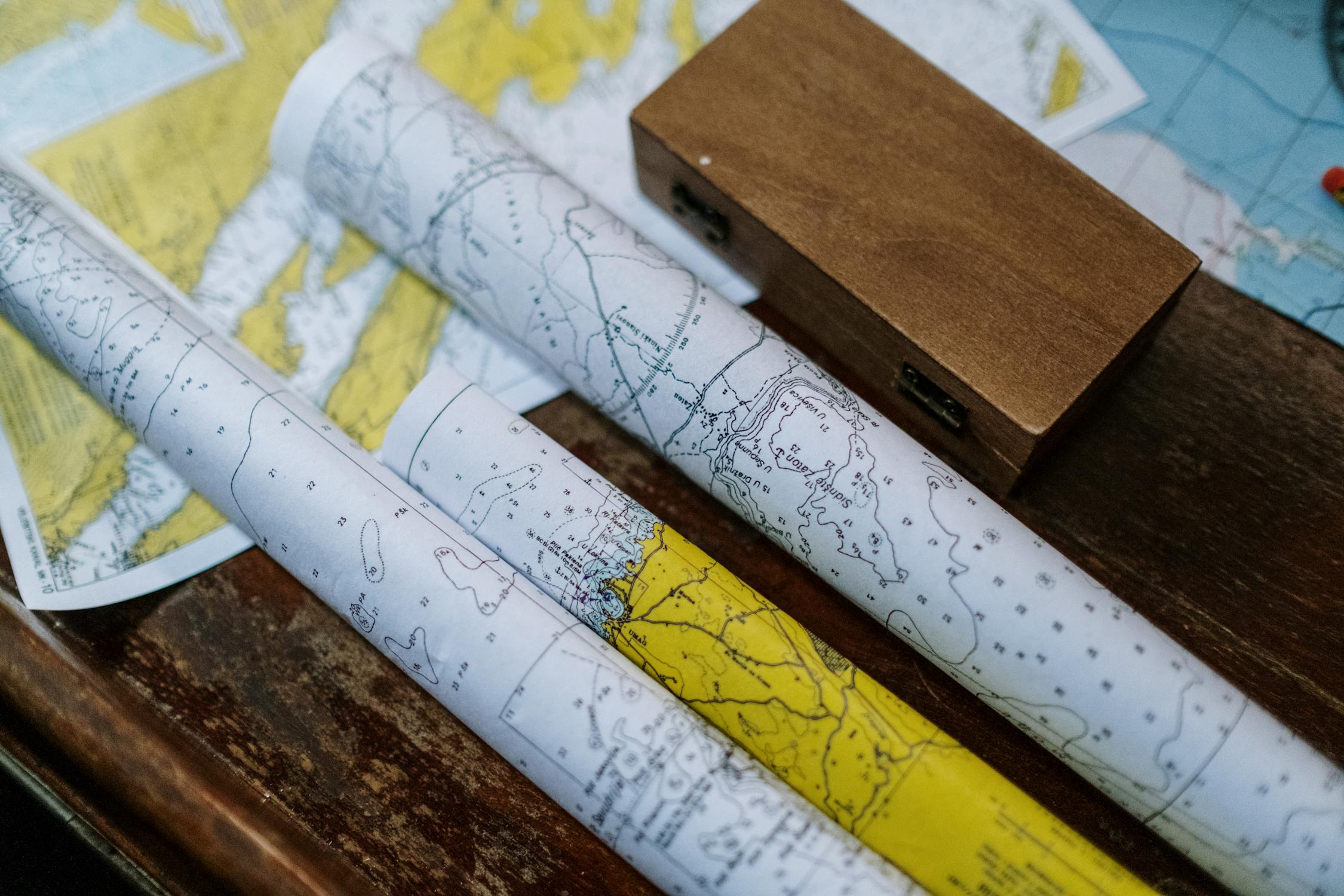
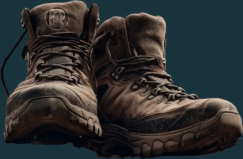
Hours were spent diving into references that included vintage trail maps, old leather hiking boots, and weathered wooden trail signs. I wanted the mark to feel like something one would see etched in a trailhead marker.
That left the rugged countryside to be the hero here: elements of boot treads and rough textures; earthy typography.

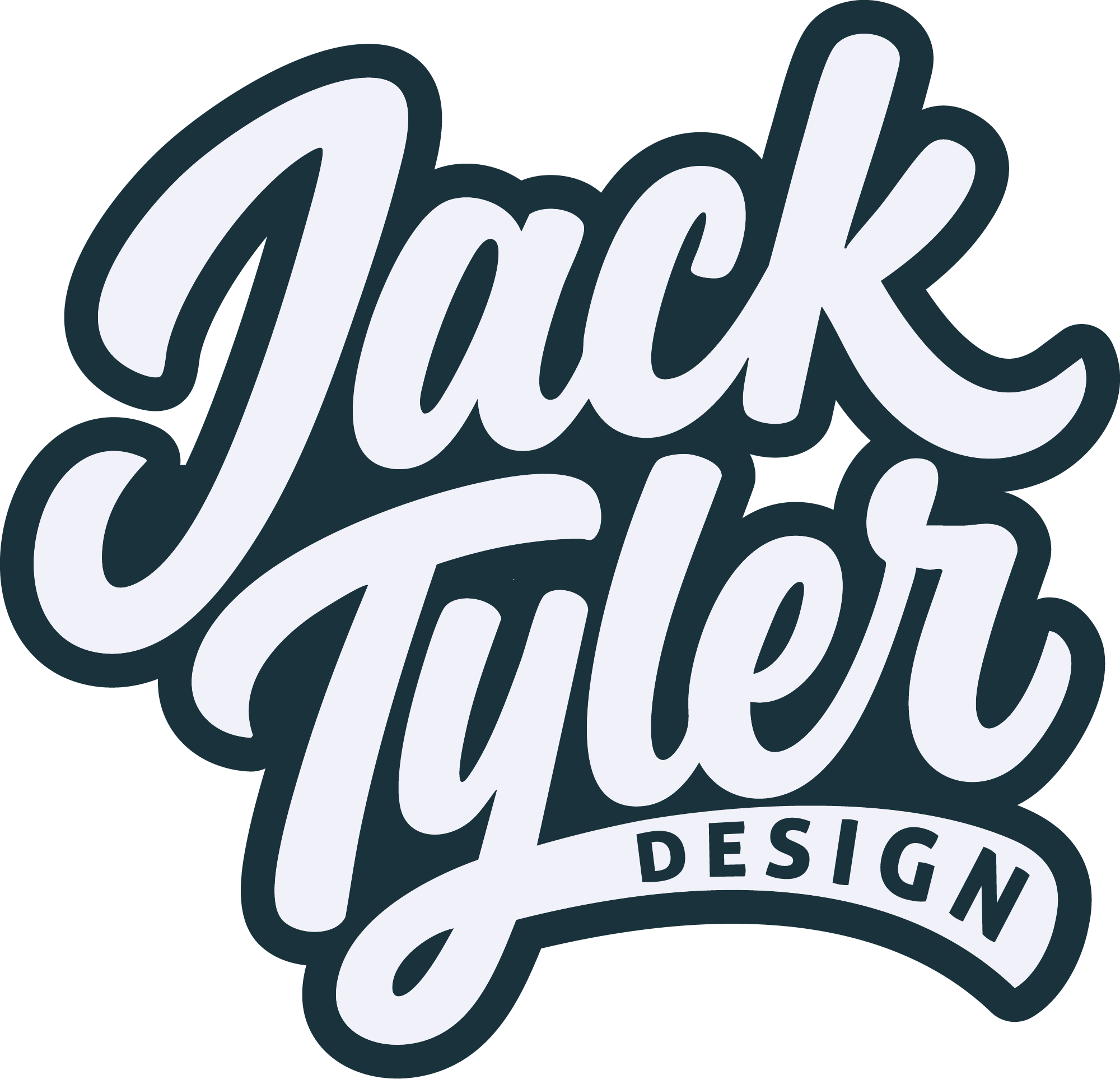
2. Typography with Personality
Fonts tell a story, and this brand needed something rustic, confident. So I chose a bold, distressed typeface that felt like it’s been through a few hikes itself. The worn edges gave it character, like it had weathered a thousand adventures.
3. Adding a Symbol that Speaks to the Brand
The logo’s focal point is a subtle, nature-inspired touch: a boot tread incorporated into the typography. Why? Because it’s simple and iconic. It tells you this isn’t just another countryside brand-it’s all about getting out there and exploring on foot.
Why It Works: Simplicity Meets Storytelling
This branding doesn’t scream for attention, it invites curiosity. The strength of a rustic logo design lies in its restraint. The worn textures, bold typography, and grounding simplicity all work together to tell a story of adventure, legacy, and timelessness.
But the bottom line of what made this project extra special was just how much the client’s story shaped the design. They weren’t just selling tours; they were crafting instances of connection with the countryside. That was a lot of emotional weight the logo needed to convey.
Lessons Learned from Designing a Rustic Logo design
Designing this piece brought back several key truths about creating great rustic logo design, including the following:
1. Authenticity is Everything
People can feel when a brand is real—and when it’s not. By leaning into the imperfections of the design, we gave this logo soul.
2. Versatility Is Non-Negotiable
From digital to physical, the logo had to shine everywhere. The distressed type and boot-tread icon scaled beautifully, whether on a billboard or a business card.
3. Less Is More
The temptation would be to throw in everything and the kitchen sink, but it’s all about restraint. A simple design allows the message to shine through loud and clear.
Beyond the Logo: Building a Cohesive Brand
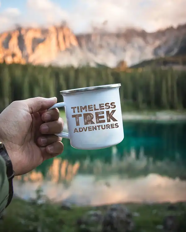
Once the rustic logo design was complete, I carried that energy through into supporting visuals and packaging. From tags and stationery to coffee cups and social graphics, the brand now feels unified, memorable, and characterful just like the treks it represents.
The result? A brand that feels rooted, adventurous, and undeniably them.
Ready to Create Your Own Rustic Logo Design?
Your brand deserves a logo that tells your story no shortcuts, no bs. If you’re ready to bring your vision to life, I’d love to hear about it. Whether you’re looking for something rugged and outdoorsy or sleek and modern, we’ll create something unforgettable.
Let’s make it happen. Hit me up, and let’s start designing!
FAQ's
Wondering about my process, pricing details, or project timelines?
Here are some frequently asked questions to address any queries you might have.
Wanna be kept up to date? Follow me:
What is a rustic logo design?
A rustic logo design typically uses rugged textures, earthy tones, and natural elements to evoke a handcrafted, timeless feel. It’s ideal for outdoor, countryside, and lifestyle brands that want to feel grounded and authentic.
Who is a rustic logo design suitable for?
Rustic logos work especially well for adventure companies, farm shops, craft businesses, glamping sites, and heritage-inspired brands. They help connect with customers through storytelling and aesthetic warmth.
How long does it take to create a rustic logo?
Most rustic logo projects take 2-3 weeks, depending on feedback loops. This includes concept development, sketching, refinement, and delivery in multiple formats.
Do you only design rustic logos?
Nope! While I love working on rugged, timeless brands, I also design clean modern logos, minimal brand identities, and full design systems across different styles and sectors.
What makes your rustic logo design different?
Every design is bespoke no templates, no shortcuts. I take time to understand your story, location, and customer, then craft a mark that feels real, rooted, and ready to last.