Sandbach Logo Design for a Pottery Class Café
Blending creativity and community into a warm, handcrafted brand identity.
Some logos just look nice. Others tell a story.
This one started with a pottery class café in the heart of Sandbach a cosy space where creativity, community, and coffee come together. The client wanted a logo that wasn’t just eye-catching, but meaningful. Something that reflected their values, their vibe, and their love for handmade moments.
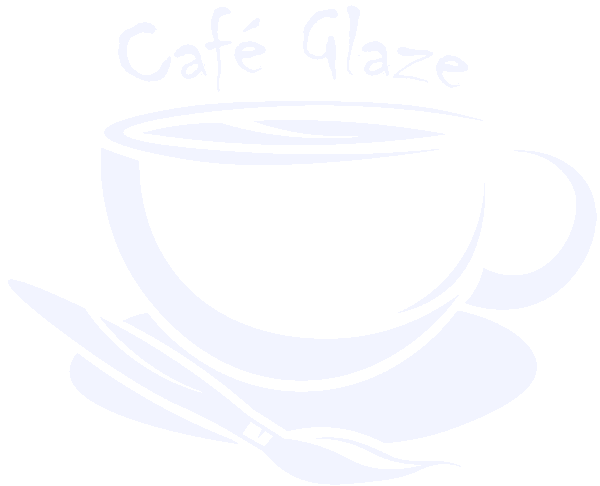
The result? A warm and welcoming Sandbach logo design that brings it all together.

Every strong brand identity starts with clarity. This pottery café isn’t just about mugs and kilns. It’s about connection.
Tucked into the centre of Sandbach, this business offers relaxed pottery classes alongside artisan coffee and homemade bakes. Locals pop in to make something, learn something, or just be part of something. So the brand needed to reflect that: creative but calm, expressive but accessible.
The Sandbach logo design had to capture more than just what they do it had to express how the space makes people feel.
Capturing the Spirit of a Pottery Class Café
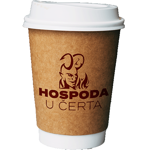
Designing this logo meant distilling the real-world texture of the café into a mark that would work everywhere from mugs and aprons to signs, stickers, and social media.
The final Sandbach logo design brings together:
A hand-drawn coffee cup to reflect warmth and approachability
Brushstroke-style curves that hint at artistry and pottery
A circular shape to suggest community and gathering
I kept the colours soft and natural, mirroring clay tones and coffee warmth. Typography was hand-refined to give a human, down-to-earth feel.
The Creative Process
Like all my branding projects, this one started with sketchbooks and conversations. I explored everything from abstract pottery symbols to type-led marks. But in the end, simplicity won.
Here’s what shaped the outcome:
Artist symbolism
The brushstroke design gives the logo a handmade character perfect for a creative environment.
Balanced layout
The round shape feels grounded and reliable, while leaving room for visual personality.
Friendly typography
Customised serif type echoes traditional signage with a modern twist.
Scalability
The logo is instantly recognisable at any size from cup stamp to signage.
This Sandbach logo design was always about more than visuals. It needed to feel like a natural extension of the space itself.
“Fantastic service by Jack, hit the spot with what we wanted as a logo to represent our business, professional throughout the process, hopefully this is the start of a long relationship between our brand and Jack working on our future projects together.”
H. Singh - Blackbird Artisan
“Really Impressed… Gave my brand a much-needed makeover with a professional and affordable logo. Really quick turnaround too. Highly Recommend.”
Nick - Lifestyle Revamp
“An insightful experience. Jack took me from not knowing what I wanted, to having a brand identity which really resonates with my business vision. I could not recommend highly enough.”
Carla - Blackbird Artisan
“From start to finish Jack and his team brought our vision and brand to life. Just from the logo design alone we have brought in £1000s of revenue. Thanks guys, great job.”
Troy - Done For You Sales Agency

Let's get creative!
Looking for a brand identity that feels like you? Whether it’s a new venture or a creative rebrand, I’m here to help craft something truly unique.
Let’s bring your story to life with design that connects.
FAQ's
Wondering about my process, pricing details, or project timelines?
Here are some frequently asked questions to address any queries you might have.
Wanna be kept up to date? Follow me:
What is the goal of this Sandbach logo design?
To reflect the pottery café’s creative, community-driven spirit through a warm, handcrafted identity.
What makes this logo unique?
The combination of a coffee cup illustration and brushstroke elements creates a one-of-a-kind mark that feels personal, expressive, and memorable.
Is the logo adaptable across platforms?
Absolutely. It’s designed to work on everything from printed packaging and signage to digital marketing and merchandise.
Can you design a logo for my small business too?
Yes I specialise in branding for independent, creative businesses that want to stand out without shouting.
How long does a project like this take?
Typically 2-3 weeks from initial concept to final delivery, depending on feedback loops and scope.


