The History Of Vintage Logos
A Journey Through Time and Style

Freelance Graphic Designer, UK
Vintage logos aren’t just a design trend, they’re a time capsule. Each curve, serif, and colour choice tells a story about the era it was born in. As a freelance logo designer obsessed with retro flair, I’m taking you on a walk through the history of vintage logos, showing how design has evolved, looped back, and stood the test of time.
Whether you’re here for nostalgia or branding inspiration, you’re in the right place.
1900
The Birth of Vintage Logos
Industrial Strength and Timeless Appeal
It all started with industry titans carving their brand into history – literally.
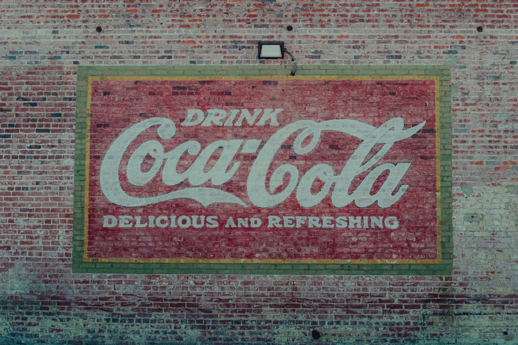
Think Ford’s bold type and Coca-Cola’s iconic script. These early logos were more than just marks; they were seals of quality and innovation, designed for longevity before that was even a buzzword.
Standouts from this era:
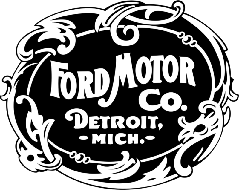
Image credit Wikipedia
1903-1907

1900
1920
The Art Deco Era:
Clean Lines, Big Statements
The roaring ‘20s and ‘30s brought elegance and symmetry to design. Logos from this era embraced geometric precision and luxurious minimalism, echoing the architecture and art of the time.
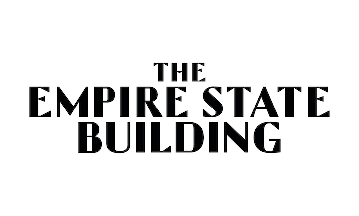
Image credit The Empire State Building
The Empire State Building: Art Deco-inspired typeface

Image credit Wikipedia
Chanel: Double-C symmetry


20th Century Fox: Monumental, stacked type with spotlight flair
1950
The Mid-Century Modern
Simplicity Meets Innovation
Post-WWII design got smart and sleek. This was the age of streamlined sans-serifs and forward-thinking branding. The mid-century modern look is still hugely influential today, thanks to its clean, practical aesthetic.
Examples:
- IBM: Efficient, technical branding
- FedEx: Hidden-arrow genius packed in minimal design

Image credit Animation Visarts
1956

1961
1960
The Psychedelic '60s and '70s
Colourful Chaos
Now things get loud. The ‘60s and ‘70s brought bold colours, funky type, and logos that felt more like concert posters than corporate marks. Brands wanted to connect with youth, culture, and counterculture.
Icons of the era:
- Woodstock logo
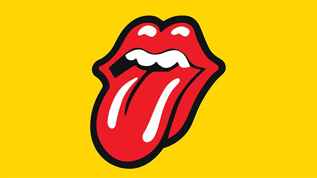
- Rolling Stones’ lips and tongue
1980
The '80s and '90s:
Neon, Nostalgia, and Pop Power
Welcome to the era of neon gradients, arcade fonts, and logos that practically shout at you. The branding of the ‘80s and ‘90s leaned into boldness and tech-driven imagery from MTV to Nintendo, it was all about visual impact.
What to note:
- Nintendo’s logo has hardly changed since
- Typefaces got chunkier, colours got louder

Image credit Sleek Logo

Image credit 1000 Designs
Vintage Logos Today: The Comeback Kid
We’re now living in a revival – not just of design aesthetics, but of the feelings those designs evoke. In an age of digital overload, vintage logos bring back trust, craftsmanship, and humanity.
Modern businesses are rediscovering the power of:
- Script fonts
- Muted, heritage colour palettes
- Hand-drawn elements
Vintage is back – but now it’s intentional, strategic, and tailored for today.


Designing a Vintage Logo That Actually Works Today
As a designer, my job isn’t to copy the past – it’s to translate it into something relevant and memorable for modern brands.
A great vintage-inspired logo should:
Feel familiar, but not outdated
Use historical cues, not clichés
Reflect your brand’s story and values
Ready to create something timeless for your brand?
Final Thought
Vintage logos connect us to something deeper – not just the past, but to the sense of permanence that great branding can offer. If you’re building something worth remembering, maybe it deserves a logo that nods to the classics while looking confidently ahead.

The Creative Compass Bulletin is your monthly guide to navigating the world of design. Packed with inspiration, expert tips, and exclusive resources, it’s crafted specifically for freelance designers who are ready to level up their creative game and grow their brand. Join a community of like-minded creatives and let the Creative Compass Bulletin point you in the right direction!


