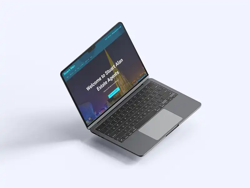
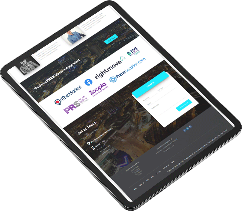
In today’s digital-first world, establishing a strong online presence is crucial for anyone involved in the real estate business. A strong real estate website is where your probable buyers and tenants start seeking their property, which means that your website is not a simple online brochure; it’s your very first impression, it’s your lead generator, and more often than not, it’s the deciding factor for a probable client. This case study elaborates on how I created this sleek, modern real estate website design that is both appealing to the eye and full of functionality.

The Problem
Seamless User Experience Design for Estate Agents
Real estate websites are not only about looking good but also about functioning well, both for buyers and sellers, landlords and tenants, and actually carrying accurate, up-to-date listings. When creating a real estate website for this Birmingham-based agency, I was aware that we would encounter several challenges, including:
- User-friendly navigation: Making it easy for buyers, sellers, landlords, and tenants to find exactly what they need.
- Clear property listings: Showcase properties with high-quality images, detailed descriptions, and user-friendly filters.
- Mobile optimization: The site works perfectly on mobile devices, where most of its users begin their search.
- SEO-friendly design: Building a site that’s flexible and scalable enough able to rank well in search engines by using the best practices in real estate website design.
The objective was clear: I needed to design a website that not only draws in potential clients but is also user-friendly and easy to navigate.
Real Estate Website Design: My Approach
In any real estate website design, I take on work with a strategic approach. Here’s how I brought it all together for this project:

Design for Functionality and Aesthetics
First impressions matter, but they need to be backed by strong functionality. I merged modern aesthetics with a layout that takes users through the site with ease. Here’s how I did it:
Clean minimalist layout:
This ensures that no clutter will obscure the users’ focus from getting to the listings and necessary information as fast as possible.
High-quality visuals:
Real estate relies on imagery, so I made sure every listing had professional-grade photos that were compressed professionally (fast loading without a quality compromise) showcasing the properties as they are.
Strong branding:
Colours, fonts, and icons were chosen based on the tone of the brand while giving a fresh and professional feeling.
Custom Features to Enhance User Experience
An important aspect of real estate website design is to have the site feature something useful to the user. Here are the custom features I added to enhance the overall experience:
- Search filters: I implemented a search feature that enables users to filter properties by location, price bracket, number of bedrooms, and property type. This made it easier for users to get what they are precisely looking for in a few clicks.
- Interacted maps: Showcase properties on a map to give users a clear overview of the exact distance between each property and nearby schools, shops, and parks.
- Smart contact form placement: Plain, simple contact forms are a no-brainer when it comes to the design of real estate websites. The contact form needed to be readily accessible from multiple points on the site for increased lead generation.
- Blog integration: I developed a blog section for SEO purposes to enable the client to post articles related to property market trends, how best to buy a property, etc. This feature is very important in that the site would keep updating new content alongside keeping the users engaged.
The Results: A Real Estate Website that Stands out
The customer loved the web design and it fit right in with the business and their values. The agency could now promote their listings with ease and attract interested buyers and renters from around the West Midlands.


Why Real Estate Website Design Matters
Designing a real estate website design goes beyond simply adding some property listings and considering it done. It’s about creating an engaging experience that attracts potential clients, helps them efficiently locate the right property, and encourages them to take action. Be it a small estate agency or a large real estate firm, it’s a well-designed, responsive-optimised website that makes all the difference in generating leads and carving a niche for itself out of so many.
Thinking of a real estate website design that actually converts? I got you covered. Whether you’re building a new site or updating an existing one, I’ll create a design that not only looks fantastic but also functions perfectly and supports your business growth.
Contact me today to kick off your project!

