How a Coventry Web Page Designer Transformed an Online Presence for an Award Ribbon Printer
Working with local businesses is always a privilege, but this project was really personal. As a web page designer in Coventry, I have known the local award ribbon printer for many years, and when they asked me to redesign their website, I just could not resist. They wanted a refreshed website that was modern, fresh, and equal to the products they sell—quality and craftsmanship-wise—so it could serve both old and new customers.
As a Coventry web page designer, I know full well just how important this is for businesses, especially at a local level. With a company selling specialised products such as theirs, there was little room but to create a strong, visually appealing, and well-navigated website. Here’s how we made that happen.

The current website had served its purpose, but now it was starting to show its age. The design was antiquated; the layout was not good from a user experience perspective, and it was not responsive. If that wasn’t enough, the site wasn’t doing much in order to showcase this unique, handmade quality of the ribbons or the decades-long history that they had with craftsmanship. We needed to shift the focus onto their premium hot foil ribbons and their ability to customise orders for whatever a person may need or any occasion.
The objective was to make a more intuitive website that showcases the company’s products, enabling the visitor to easily walk them through the website and purchase whatever they would want. Of course, we would have to optimise the website for mobile usage since most of today’s customers browse on the go.
The Approach
1. Understand Their Core Message
First of all, I really delved deep into the business before starting any design. It was never about just selling ribbons but selling achievement and excellence; the ribbons manufactured are symbolic of success. What we wanted to have the website do is reflect that very level of quality, prestige-the same elegance as their physical product. My aim was to create a digital space that mirrored the same elegance of their physical product.
2. Modern, Clean Design
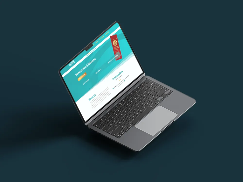
As their go to web page designer, I knew it had to be simple, yet striking; more visual in emphasis. We used strident colours which were bright and spoke volumes about the energy and creativity of this company. I chose turquoise as the primary background colour to make the images pop and give the site a clean and modern look. The navigation was remade to become intuitive: a user can get to a product or information in just a few clicks.
The new banner is high impact, an obvious call to action to “Order Today.” We then underlined the main selling points-any colour, any design, and fully customizable-so that the users immediately understand the flexibility and scope of their offering.


3. Mobile Optimization
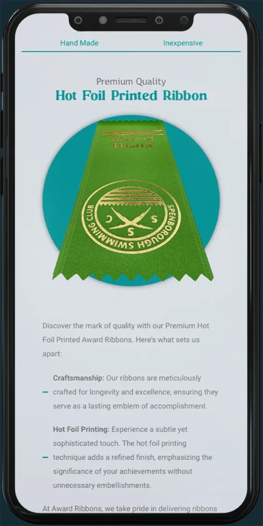
With such a huge portion of their clientele shopping via mobile devices, making it a mobile-friendly experience was paramount. Their old site scaled quite poorly both on smartphones and on tablets, so I designed the new site to be fully responsive. Be it desktops, tablets, or smartphones, the new website looks sharp and works seamlessly.
4. A Display of Craftsmanship
Another signature trait unique to the company has to be the hot foil printed ribbons for which it is so famous due to their high quality. The website contained a section dedicated just for them, with high-resolution photos and explaining the craftsmanship involved in a single ribbon. Not only does this sell the product but also it educates a potential customer on the minute details involved in an order.
5. Seamless Ordering Process
Big improvement: streamlining the How to Order section. I just cleaned it up into easy, step-by-step instructions with sufficient graphics so it is absolutely crystal clear to the customer. Whether they are ordering personalised or standard ribbons, the journey from browsing to purchasing was now much easier. No guesswork, no confusion-just straightforward steps that anyone can follow.
The Results
The customer has already seen, since the new site launched, a marked increase in both inquiries via the website and in orders. The clients were spending more time on the site, navigating the product options and placing custom orders. A clean, professional design with an intuitive user experience has made all the difference.
Moreover, the optimization of the site for mobile devices opened even more doors to customers, especially those who want to shop or inquire on the go. The company’s premium products now have a premium online home to match, and that is something we are both really proud of.


Conclusion
A website for any business is more than a virtual storefront-it’s an impression. As a web page designer based in Coventry, I’ve had experiences of how vital that is with regard to local businesses. This project, again, was a perfect example of how a properly designed and mobile-optimised website can make all the difference in changing the fortunes of a company’s online presence and helping it make its presence felt within a competitive market.
Ultimately, this was more than just a website redesign; it was about re-introducing the marketplace to this company and re-positioning it as a current, quality provider of award ribbons. It has been a great experience to work with a business I have known for many years and to help it show off in the digital world what it does best.
If you’re looking for a web page designer in coventry (or across the UK) get in touch and let’s get started today


