As a website design company in Coventry, I was keen to get started on designing and building an e-commerce website for a brand-new horse care product line. I didn’t have any previous website to refer to or work from, so I needed to create a totally new, engaging, and fully optimised website for the business to use to start selling to customers right away.

Since this was a brand-new enterprise, establishing a solid online presence that could foster trust was the first priority. Horse owners need to feel confident that they’re buying quality, reliable products, so the site needed to convey that level of professionalism while keeping the process easy and enjoyable for users.
I developed a strategic plan based on three main objectives:
Strong Brand Identity
The new site needed to position the brand and convey trust right from the word go. I designed a sleek, clean design with loads of white space, so the products could be the stars.
Optimised User Experience
Online shopping shouldn't need to be rocket science. I focused on creating a seamless shopping experience that made it easy for users to find what they needed and check out quickly.
Mobile-First Design
With most online shoppers accessing through their phones, I aimed for a responsive mobile design. Optimisation for the whole site on mobile would guarantee users a seamless experience on any device.
Challenges and Solutions
Since this was going to be the launch of a new brand, everything in user experience had to work seamlessly. Here’s how I, as their chosen website design company, tackled each challenge:

1. Establish Credibility for a New Brand:
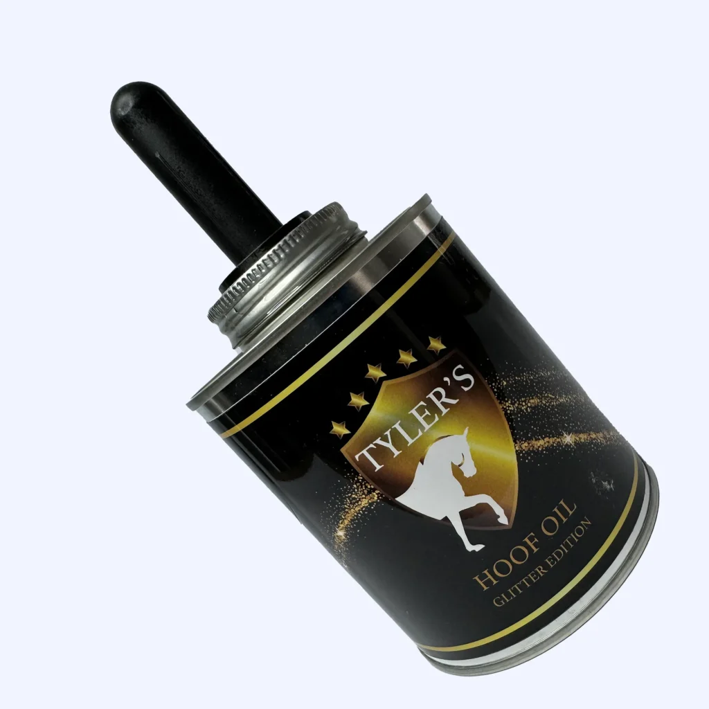
The company was new in the market and didn’t have any customers yet. Therefore, the primary objective was to gain credibility. I designed a clean, modern website using a colour scheme of black, white and gold reflecting the existing brand identity. Each product had big, high-quality images with transparent descriptions that contributed to buyers’ confidence.
2. Ease of Navigation:
It was vital to ensure users could find what they were looking for fast. I designed a site structure with clear product categories and a search function, making navigation very easy. Because of this approach, every visitor browsed more products, and that will surely drive higher cart values.
3. Fast Load Times and Mobile Optimisation:
Website speed was crucial to keeping the interest of users, especially on mobile. I optimised images, and made sure the site loaded fast to avoid high bounce rates. Not only this, but with mobile shopping on the rise, I also made sure that the entire user experience was as great on mobile devices as it was on desktop.
The Results
It turned out just the way the client wanted.
30% Increase in Sales
The intuitive design mixed with a mobile-first approach had higher conversion rates. Frictionless shopping allowed them to browse and get more products, therefore selling 30% more within the first few months.
Engaging user experience
Ease of navigation, speed, and look-and-feel that were exceptional kept them longer on the site. Visitors viewed an average more number of pages per session, with more likelihood to complete a purchase, reducing bounce rates while improving overall engagement.
Conclusion
This project is proof that with focused e-commerce design, and the right website design company, even the most fledgling of businesses can make a big splash. I pride myself on handcrafting websites to meet specific needs for both our clients and their customers. For this equine care brand, I delivered a site that looked great but performed even better-netting increased sales and higher engagement.
Whether it is a new company that needs to create its website or just an update of a pre-existing one, I’m ready to take it to the next level. If you’re looking for a website design company in coventry, Just drop me a line and let’s talk about transforming your website into a growth engine.

