Why Are So Many Companies Changing Their Logos to Flat Designs?

Freelance Graphic Designer, UK
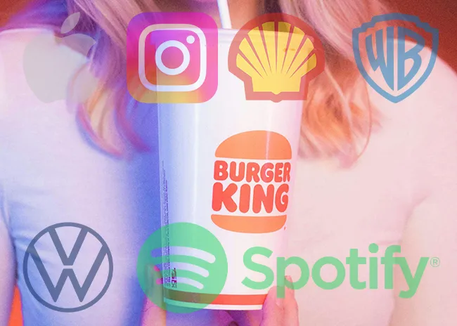
If you’ve noticed that brands everywhere from tech giants like Google to fast-food chains like Burger King are swapping their shiny, 3D logos for simpler, flat designs, you’re not alone. It’s a trend that’s taken the design world by storm over the past decade. But why? What’s so special about flat design that companies are willing to overhaul their entire branding for it?
So let’s break it down, and of course, talk about how you can use this trend to level up your own brand.
What Is Flat Logo Design, Anyway?
Flat design is just what it sounds like: a minimal approach to design that skips 3D effects such as shadows, gradients, and texture. Think clean lines, bold colors, simplicity.
Think, for example, of Apple’s old skeuomorphic icons. You know, those that resembled real-world objects-along with its new icons that are flat. It’s a complete about-face from realism to minimalism.
Why Is Everybody Going Flat?
There is no single reason, but rather several trends and practicalities combined to make the flat design of today’s favoured choice in modern branding.
1. It's All About Digital
Most of the branding today happens online, from websites to apps, from social media, or anything one may name. Flat designs look lightweight and are scalable while being sharp on any screen.
Take Spotify, for example: its single-color, flat logo design looks professional whether viewed from a billboard or that teeny corner on your phone’s screen. Flat design simply works a whole lot better when digital.
2. Simplicity Sells
In a world of noise, simplicity cuts through. Flat design is easily recognizable from a glance around, and that’s just what brands need. Think of how Apple’s logo comes across compared to an intricate one, like the old logos of Pepsi. Which one rings in your head? Flat designs are sleek and modern, instantly memorable.
3. Nostalgia With a Modern Twist
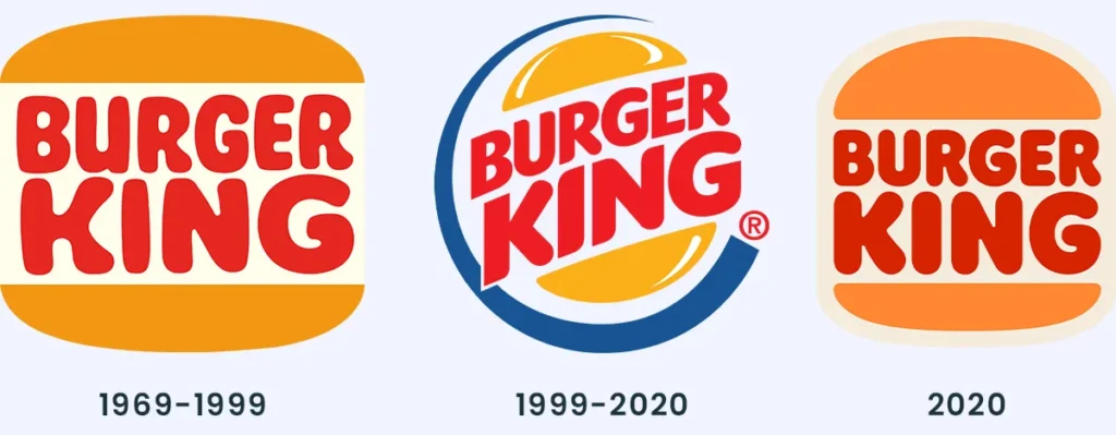
Interestingly, the flat design trend pulls in some elements of nostalgia, too. Brands are going back to their roots and simplifying their logos into what they once looked or sounded like-just sans the dated feeling. Take Burger King for example. It recently moved from a glossy 3D style logo to a flat one that curiously looks much like its branding back in the 1970s. It does feel new and old at the same time.
4. Accessibility Matters
Another point one would never have thought of is that flat designs are more accessible. Complex gradients and textures can just become unreadable; think visual handicaps. The big, flat logo? That will be way simpler to recognize or even process.
NOT EVERYBODY IS A FAN
Of course, to some people, the whole flat design direction isn’t exactly appealing. To some, this is too plain; it can make the brands eventually look, well, generic-they lack some character, some personality that the logos should really give with or, at minimum, a lot more detail to.
And quite frankly? They’re right. Flat design really works when married with intention. A generic flat logo is just that: generic. However, a really thought-out, well-designed flat logo still has a lot to say.
What Does That Mean for Your Business?
If you rebrand, this is worth considering: flat design. But never jump on the bandwagon since it’s a bandwagon. To get started, think with the following: What is my brand’s personality? Flat design provides great results if your brand is modern, minimalist. The vibe could be vintage, handcrafted better fitted in a more textural or detailed looking.
Where will my logo be used? If your logo lives digitally, then flat design makes sense. If you’re printing most of your materials, you may want something a little more versatile.
Does my logo feel dated? If your current logo screams 2008 hello, gradients! then it’s time for an update.
Need Help Designing a Modern Logo? Let's Talk
Flat design is one of those trends that can be puzzling to work your way around. It knows when to follow the pack and when to buck off, sticking to what makes your unique brand story unique. Whether you’re ready for a refresh of a logo or creating from scratch, let’s collaborate.
I design logos that feel fresh, timeless, and just right for the digital world we live in today. Click here to work with me and let’s design something you and your customers will love.
Flat design in a nutshell is not a passing fad, but rather it reflects the change of branding that is finally attuned to digital-first realities. Thus, if simplification, refinement, and modernization inspire you, this could be the time for that leap forward.
For more insights on enhancing your brand’s identity and creating impactful design solutions, stay tuned to my blog or contact me directly. Let’s work together to elevate your brand to new heights!
The Creative Compass Bulletin is your monthly guide to navigating the world of design. Packed with inspiration, expert tips, and exclusive resources, it’s crafted specifically for freelance designers who are ready to level up their creative game and grow their brand. Join a community of like-minded creatives and let the Creative Compass Bulletin point you in the right direction!
