
How I Build Brands That Look and Feel Cohesive

Freelance Graphic Designer, UK
Ever seen a brand that feels… scattered?
Different fonts on every post. A logo that looks stitched together from five different ideas.
You don’t know what they stand for and honestly, neither do they.
Cohesiveness isn’t a luxury.
It’s the secret weapon that makes brands look professional, memorable, and trustworthy right out of the gate.
Here’s a straight-shooting look at how I build brands that don’t just look good they feel right from top to bottom.
1. It Starts With Clarity, Not Just Creativity
Before I touch a pencil or open Photoshop, I dig into the real work: finding the heartbeat of the brand.
✅ Who are you really trying to reach?
✅ What feeling do you want people to have when they see your brand?
✅ What makes you different from the noise?
Branding without clarity is like building a cabin with no blueprint guaranteed to fall apart at the first strong wind.
So, we start by getting crystal clear on your mission, values, and audience.
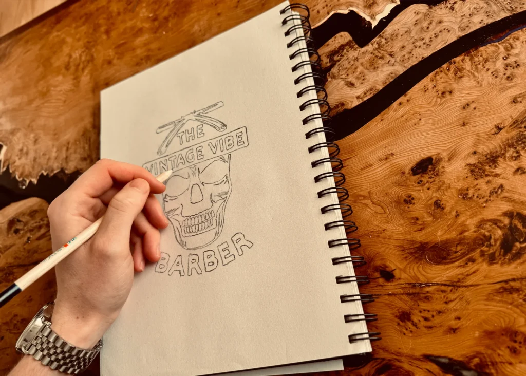
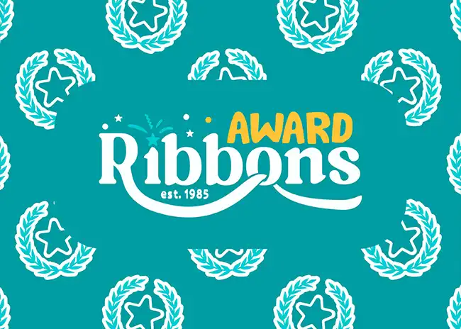
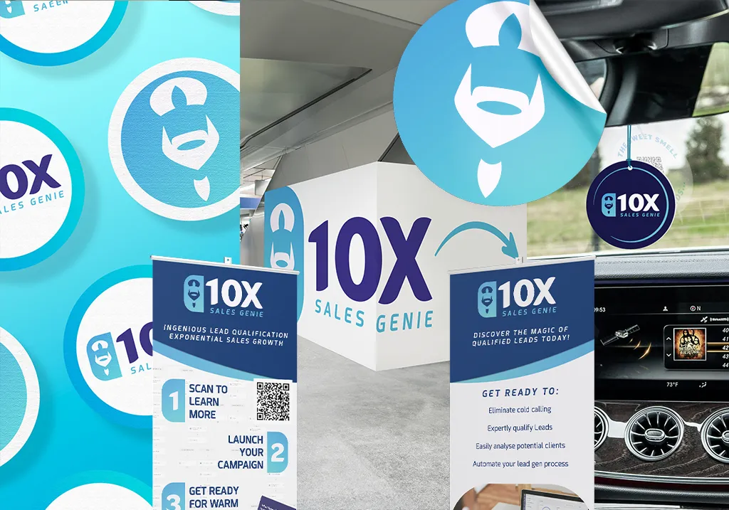
2. I Build a Visual Language - Not Just a Logo
A logo is just the tip of the spear.
The real work is creating a visual system that makes everything feel connected — across your website, socials, packaging, you name it.
🛠️ What’s in the toolkit?
- Primary logo + alternate logo + icon
- Brand colour palette (with clear uses for each tone)
- Typography hierarchy (headlines, body, accents)
- Graphic elements or textures that build brand atmosphere
This way, whether it’s a billboard or an Instagram Story, your brand speaks the same language loud and clear.
3. I Obsess Over Consistency Without Losing Flexibility
Good brands don’t feel stale but they also don’t feel random.
I create systems that are tight enough to stay recognizable, but loose enough to grow with you.
🎯 Think:
- Your logo works in color or black-and-white
- Your fonts feel natural on web pages and print ads
- Your brand patterns or icons can be used creatively without “breaking” the look
Cohesion isn’t about rigid rules it’s about giving you a strong enough backbone that creativity can thrive.
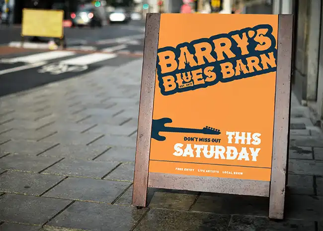
4. I Design With the End Use in Mind
It’s easy to make something pretty in a vacuum.
It’s harder and more valuable to design with where and how your brand will show up in the real world.
When I’m building your brand identity, I’m thinking about:
- How will this look on a mobile screen?
- Will this logo embroider cleanly onto merch?
- Does the typography still feel strong on a tiny website button?
By designing for real-world use, I make sure your brand stays rock solid no matter where it goes.

5. I Anchor Everything to Story and Feel
At the end of the day, a cohesive brand doesn’t just look good it feels aligned.
Whether it’s rugged, adventurous, minimalist, or luxury every visual decision ties back to the emotion we want to spark in your audience.
Because when the visuals match the vibe?
That’s when your brand stops just “looking cool” and starts becoming unforgettable.
Want a Brand That Looks as Good as It Feels?
If you’re tired of second-guessing your visuals, patching things together with freelancers, or feeling like your brand is “almost there but not quite” let’s fix it.
👉 Reach out here and let’s build something that doesn’t just look class it feels like it was built to last.