
Designing for Noise
How Music Event Brands Actually Compete for Attention

Freelance Graphic Designer, UK
There’s no polite way to say this, most music event branding is forgettable…
Same neon gradients. Same generic DJ silhouettes. Same “techno font pack #3” slapped onto a black background.
Meanwhile, attention has never been harder to earn. You’re not just competing with other events, you’re competing with TikTok, Netflix, WhatsApp, and someone’s mate sending voice notes at 2am.
So if your brand doesn’t hit instantly, it’s dead.
This isn’t about “good design.”
It’s about survival in a noisy ecosystem.
Let’s break down what actually works in 2026 and where most organisers are getting it wrong.
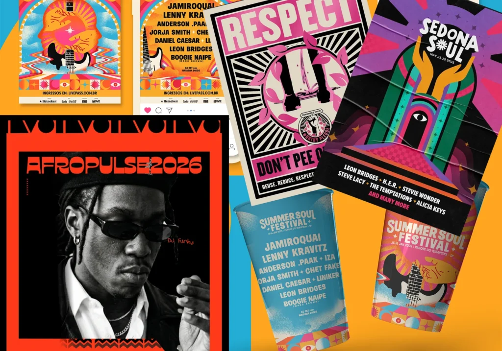
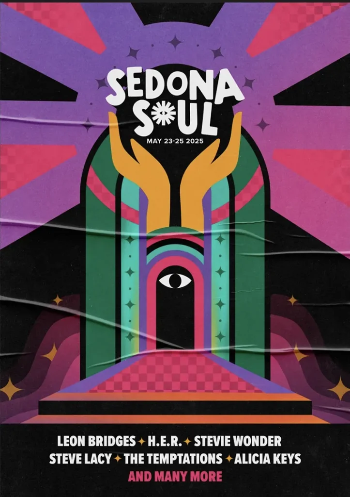
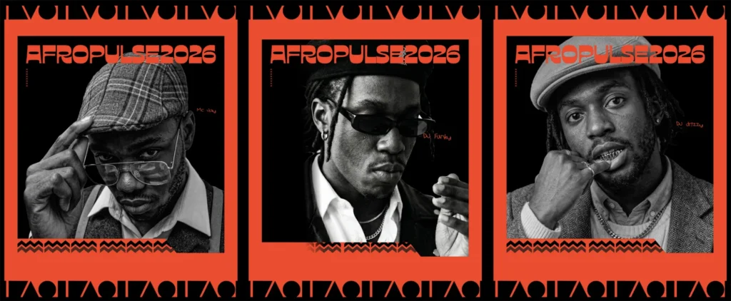
1. Posters Are Not Information - They’re Weapons
Most event posters try to say everything.
Branding. Lineup. Date. Time. Venue. Sponsors. Ticket tiers. Instagram handle. QR code.
That’s the problem.
Posters aren’t meant to inform. They’re meant to interrupt.
The best posters in 2026 follow one rule:
You should understand the feeling in under 2 seconds even if you don’t read a word.
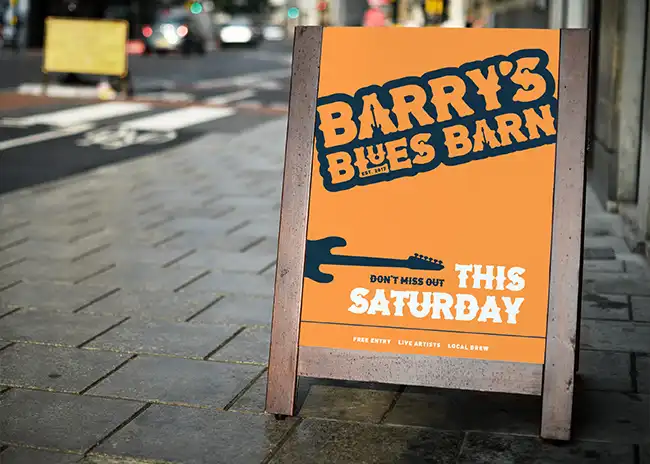
Credit – Bella Thompson On Behance
Credit – Da_Extreme On Behance
What actually works:
- Aggressive simplicity (one idea, pushed hard)
- High contrast, not “pretty gradients”
- Visual tension (weird layouts > safe grids)
- Type that feels like sound, not text
What’s dead:
- “Clean corporate festival branding”
- Safe symmetry
- Trying to appeal to everyone
Opinion:
If your poster looks like it could promote a corporate networking event…
you’ve already lost your audience.
People don’t go to music events for clarity.
They go for energy, identity, and belonging.
Your poster should feel like that.
2. Social Visuals: Stop Designing Posts... Start Designing Moments
Here’s the uncomfortable truth:
Your Instagram grid doesn’t matter.
Nobody is scrolling your profile thinking,
“Wow, nice consistency.”
They’re scrolling at speed, half-distracted, half-bored.
Your job is to stop the scroll.
Not with polish. With pattern interruption.
What actually cuts through:
- Movement-first design (Reels > static)
- Chaotic but controlled visuals
- Kinetic typography synced to music
- Unexpected pacing (fast cuts, then silence)
What most organisers do:
- Post lineup tiles
- Drop generic countdowns
- Recycle poster into square format
That’s not content. That’s admin.
Opinion:
If your content can be ignored without emotional loss,
it will be.
Design social visuals like trailers, not flyers.
Think Netflix intro energy, not Canva template.
3. Stage Visuals: Where Most Brands Completely Fall Apart
This is where the gap between amateur and serious brands becomes obvious.
You’ve seen it before:
Strong poster. Decent socials.
Then the event happens… and the visuals are just random VJ loops from YouTube.
That disconnect kills credibility instantly.
Stage visuals are not decoration.
They’re the physical embodiment of your brand.
What works in 2026:
- Custom visual systems tied to identity
- Loops that evolve with the music
- Clean Event Shots
- Visual storytelling across the night
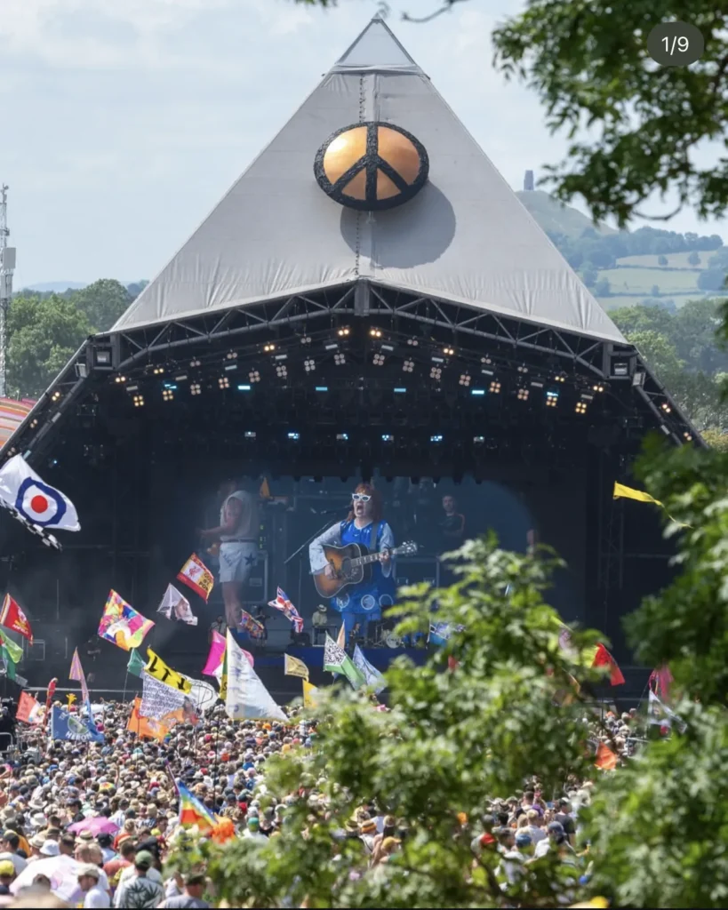
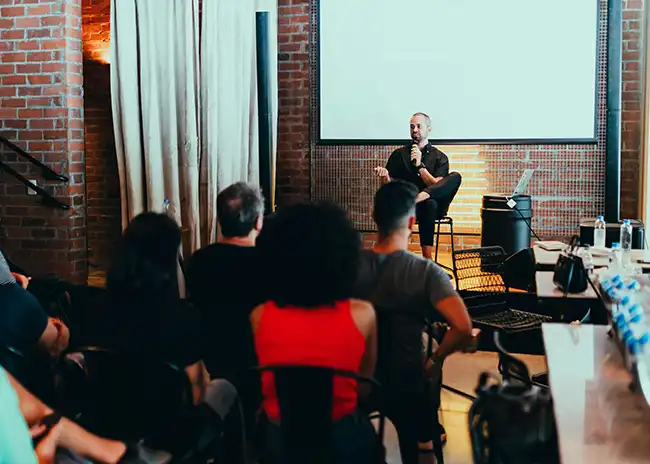
Credit – Glastonbury Festival
What’s lazy:
- Stock visuals
- Generic glitch loops
- No connection to branding
Opinion:
If your stage visuals don’t feel like an extension of your brand,
you’re running two separate businesses:
- Your marketing
- Your actual event
And they’re not talking to each other.
That’s why people don’t remember you.
4. Identity Systems: The Difference Between a One-Off Event and a Movement
This is the part most organisers skip entirely.
They design a poster, not a system.
So every material looks slightly different.
Feels slightly disconnected.
And builds zero long-term recognition.
A real identity system includes:
- Defined typography hierarchy
- Colour logic (not random palettes)
- Motion behaviour
- Graphic elements that evolve, not reset
- Tone of voice
Credit – Bea Souza On Behance
Why this matters:
Because attention compounds.
If someone sees your brand 5 times and it looks different each time…
you’re starting from zero every time.
Opinion:
Consistency isn’t boring, it’s powerful.
The strongest music brands don’t reinvent themselves every event.
They refine and amplify.
Think about it like a sound:
recognisable, but evolving.
5. The Brutal Reality: You’re Not Competing on Lineups Anymore
Anyone can book DJs.
Not everyone can build a brand people want to belong to.
In 2026, the winners are:
- Distinct
- Opinionated
- Visually aggressive when needed
- Cohesive across every touchpoint
The losers?
Safe. Generic. Forgettable.
So What Should You Do Next?
If you’re running events and your visuals aren’t converting attention into ticket sales, here’s the hard truth:
It’s not the algorithm.
It’s not your audience.
It’s your positioning.
You don’t need more posts.
You need a stronger identity, sharper visuals, and a clearer point of view.