
How to Effectively Use Negative Space in Logo Design
Negative space in logo design isn’t just the background-it’s unsung hero storytelling. When used right, it creates depth, intrigue, and a visual “aha” moment that buries itself in people’s minds. Now, let’s break down how to wield negative space like a pro and create logos that do more than look pretty-they mean something.
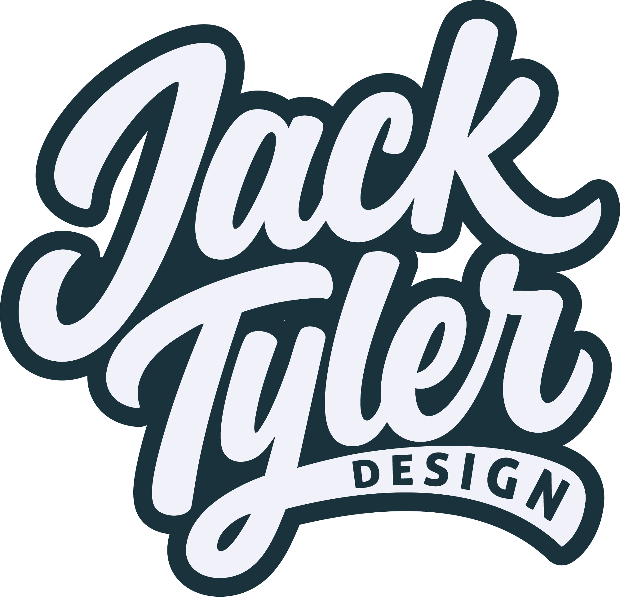
What Is Negative Space?
Negative space is the amount of empty space around and within the elements of the design. But let us not be misled by the word “empty,” because it is not wasted space; it’s the brilliant pause between the notes in a song. Think about the FedEx logo-hidden within the type is a forward-pointing arrow, subtly reinforcing the brand’s focus on speed and precision. That is negative space working its magic.
As a young designer, I never paid much attention to negative space, packing designs with shapes and text. Then, one day, a client told me, “This looks…busy.” Ouch. It made me rethink my approach, and honestly, it was a game changer. Now, I see negative space as the unsung MVP of great logo design.

Why Negative Space Matters
Here’s why mastering negative space is worth your time:
1. It Adds Depth and Duality
A logo with hidden elements in its negative space is like a good plot twist—unexpected but satisfying. For example, the Spartan Golf Club logo uses negative space to show both a golfer and a Spartan helmet. It’s clever and memorable, delivering twice the impact in a single glance.
2. It Simplifies Complexity
It’s not about stripping down to nothing; it’s about making every detail count. Negative space makes a logo clean and uncluttered even when it’s full of meaning. Think about the WWF logo using negative space to shape a panda with only a few bold strokes.
3. It Grabs Attention
Our brains are hardwired to love puzzles. A clever use of negative space pulls people in, challenging them to find that hidden detail. This engagement keeps the logo—and the brand—in their minds for longer.
How to Use Negative Space Like a Pro
Here’s a step-by-step guide to make your negative space work harder:
1. Start with a Strong Concept
Negative space is not a trick you add afterwards. It’s from a concept point of view. Ask yourself, “What’s the story this brand wants to tell?” Innovation, heritage, fun-a good story sets a base. The Pro Tip: First of all, it’s always paper and no screen. Just pen, paper, and your imagination. The fastest way to explore the interplay between shapes and space.
2. Think in layers
A great logo works on many levels. Now, have fun and play with negative and positive space. Can that negative space spell out something quite unexpected that enhances the brand identity?
For instance, in one of my projects for a coffee shop, the negative space between two coffee beans outlined the silhouette of a steaming mug. That was not design-it was a mic drop.
3. Lean Into Simplicity
Negative space works best when it’s simple. Don’t overload your design with unnecessary elements. Every line, every curve, and every gap should have a reason for being.
Challenge yourself: If you remove a detail, does the logo still work? If yes, leave it out.
4. Test at Different Sizes
Negative space details may be lost when the logo is minimized. Always check your design in different sizes to ensure it works on a billboard or a business card.
Common Mistakes to Avoid
- Overcomplicating the Design – Negative space is about subtlety. Too many ideas might just backfire. Keep it focused.
- Forgetting Functionality – A clever design is useless if it’s unreadable or confusing. Always prioritize clarity.
- Ignoring the Brand’s Message – Cleverness for its own sake doesn’t mean a thing. The negative space must tell the brand story, not override it.
Ready to Elevate Your Logo Game?
Want to impress your audience with a logo that makes your brand forever memorable? Let’s do it together. Design from scratch or give your existing brand a new feel. Let’s collaborate on something meaningful, clean, and full of personality.
Contact Me Here to get started!
Final Thoughts
Negative space isn’t just a design element—it’s a storytelling tool. It is the art of saying more by showing less. With practice, patience, and a touch of creativity, you can create logos that spark curiosity and leave a lasting impression.
Next time you brainstorm, don’t fill the space with design; trust me, once you start seeing negative space as an opportunity, there’s no going back.
For more insights on enhancing your brand’s identity and creating impactful design solutions, stay tuned to my blog or contact me directly. Let’s work together to elevate your brand to new heights!