
Responsive Web Design and Its Impact on User Engagement
Let’s face it: your phone is basically an extra limb at this point. Whether you’re doom-scrolling Twitter (or whatever we’re calling it now) or looking up your next trip out of the city, mobile devices are where life happens. So, if your website still looks like it belongs in 2010, with text spilling off the screen and buttons too small to press without a stylus, it’s time for a wake-up call.
This is how it is now: mobile-friendly design isn’t a nice-to-have anymore; it’s a game-changer when user engagement is concerned. Here’s why it matters, how it works, and why you should care if people are sticking around your site or bolting after two seconds.
Why Mobile-Friendly Design Matters
The thing is, upwards of 60% of web traffic is coming from mobile, and over half of your potential audience scrolls through your site on their way to work on the subway, lying on the couch, or in a line getting their morning coffee. If it doesn’t look right or work right on their phone, it’s over faster than you can say “bounce rate.”.
I’ve done what every web development newbie does: designed first for desktop. That works great for desktops: it’s clean, modern, and functional. Till someone whips out their phone and suddenly that novel was being read through the keyhole. Nobody stayed long enough to see the good stuff. And that’s how I learned that tough truth: mobile design isn’t optional-it’s survival.
How Mobile Design Boosts Engagement
A mobile-friendly site is not only beautiful; it’s functional. How it directly contributes to engaging users:
1. Faster Loading Speed
On mobile, every second counts. If your site loads in more than 3 seconds, 53% of users would have left. Mobile-friendly design gives way to prioritizing lightweight elements and quicker loading time, translating to less waiting and more exploration.
2. Better Navigation
Nobody wants to have to play hide and seek with your menu bar. Mobile-friendly designs make big, tappable buttons the norm, along with easily findable features.
3. Better Readability
Tiny fonts, squished layouts? No thanks. Responsive design ensures text and images resize perfectly to fit any screen. When it doesn’t feel like squinting at an eye chart, people actually read and stick around.
4. Better SEO Rankings
Google doesn’t play games. If one site is mobile-friendly and the other isn’t, its algorithm favors the friendly one; that is why if your site isn’t optimized, it bombs in search rankings. And if no one finds your site, how are they going to interact with it?
What Happens When You Get It Right
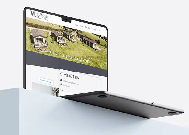
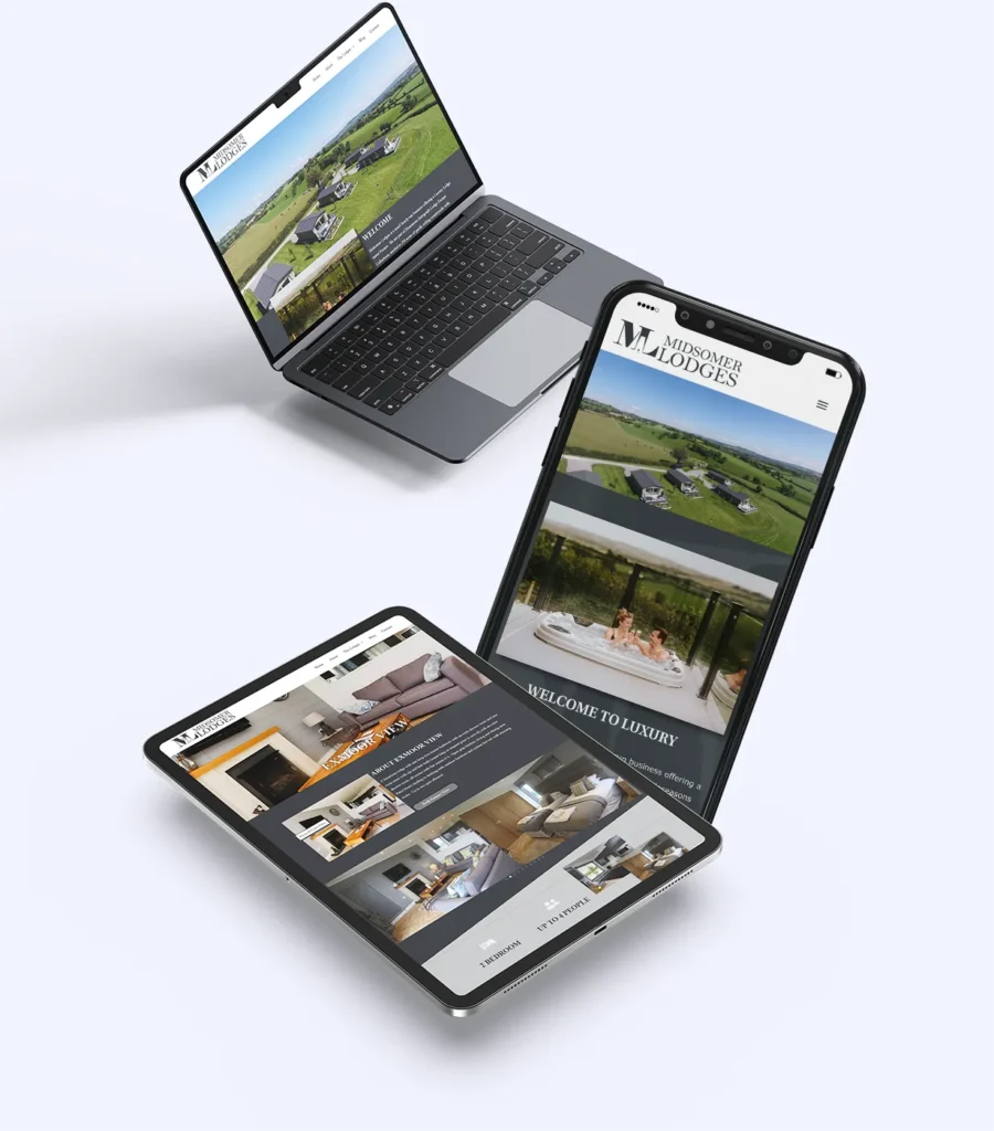
Let me paint this picture for you: once, a client came to me with this clunky, antiquated site. It looked fine on desktops but was a disaster on mobile. Think pinching, zooming, moving your phone forward and back and frustrated sighs. We worked together, creating a sleek, responsive design that played nicely with all devices.
Results? Bounce rate down 35%, average session time more than double the average, and a 25% lift in conversions. And icing on the cake? Their Google ranking improved, making them visible to new customers.
That’s the power of mobile-friendly design.
Don't Leave Your Users Hanging
You wouldn’t invite someone to your house and then lock the front door, right? That’s what having a non-mobile-friendly site feels like for your users. You’re basically asking them to leave before they’ve even walked through the digital door.
Investing in mobile-friendly design is the welcome mat; it’s the, “Hey, I see you and I’ve made this easy for you.” And let me tell you, your users are going to stick around when they feel seen.
Ready to Upgrade Your Website?
Mobile-friendly design is about reaching your audience where it has elected to belong. Your website isn’t cutting the mustard-let’s patch things up. My website approach, taken toward reaching every screen, has taken tonnes of brands from forgettable to unstoppable. Like the sound of that? Let’s Chat. Click below to get started:
Final Thought
The days of ignoring mobile design are over. It’s not just about aesthetics; it’s about creating a seamless, enjoyable experience for your users-whatever they’re using and wherever they are. So don’t let your site get left behind.
Your audience is waiting, phone in hand. Are you ready to meet them there?
For more insights on enhancing your brand’s identity and creating impactful design solutions, stay tuned to my blog or contact me directly. Let’s work together to elevate your brand to new heights!