Graffiti Logo Design West Midlands

Revamping a West Midlands Graffiti Logo Design

Grafiti Logo Design Icon For A West Midlands Business Showing a spray can and 2 rollers in white and turquoise

The Challenge:

Keeping Recognition While Upping the Game

When I started working on this project for Graffix Art, Lewis (the client) sent over his original graffiti logo design—a self-designed piece that already had some traction in his community. It featured a spray can at the center of a circular layout, with bold text radiating energy. While the concept was solid, the execution needed a professional touch.

The challenge was clear: retain the recognition they’d built locally while transforming the design into a polished, versatile logo that could grow with their brand.

The Initial Concepts: Exploring the Possibilities

To kick things off, I explored four distinct directions, each offering a fresh take on their brand identity. Here’s a breakdown:

Refined graffiti logo design in black and teal with spray can and orange paint accents.

Concept 1: The Badge Design

This concept featured a central spray can with crossed paint rollers in a badge-style layout. It emphasized symmetry and balance, leaning into a clean, professional vibe.

Strengths:

Timeless, versatile, and balanced.

Challenges:

The colour didnt quite resonate with the client

Fun graffiti logo concept featuring a smiling spray can character with bold circular typography.

Concept 2: Playful Character Design

This approach introduced a smiling spray can character holding paint rollers, giving the logo a lighthearted, approachable feel.

Strengths:

Fun and engaging.

Challenges:

It lacked the edgy, raw energy associated with graffiti.

Bold typographic graffiti logo concept with the words 'Graffix Art' in block lettering and teal highlights.

Concept 3: Bold Typography

A typographic-focused design featuring blocky, graffiti-inspired letters. This was a simple and striking take on their brand identity.

Strengths:

Minimalist and easy to reproduce.

Challenges:

It didn’t tell a full story about their work.

Playful graffiti logo concept with dripping paint, bold script, and spray can elements.

Concept 4: Graffiti Script

This design leaned into a graffiti aesthetic with fluid script fonts, dripping paint effects, and bold outlines, capturing the essence of street art.

Strengths:

Authentic and expressive.

Challenges:

It struggled with versatility for professional branding applications.

Choosing the Direction: Concept 1 Wins

After reviewing the options, the client gravitated toward Concept 1. Its badge-like design struck the perfect balance between professionalism and creativity, providing a strong foundation for the revamp. From there, I refined the graffiti logo design to make it uniquely theirs.

The Revamp: Honoring the Original While Elevating the Brand

The key to this refresh was retaining the elements of the original graffiti logo design that resonated with their community while giving it a modern, professional edge. Here’s how I approached the transformation:

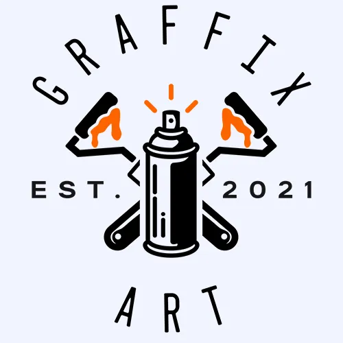
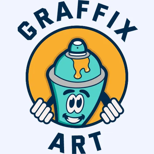
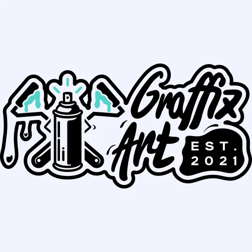
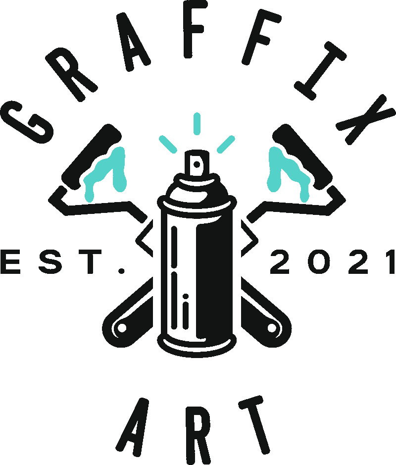
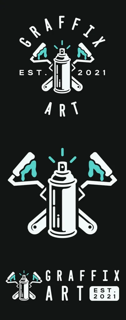
1. Refining the Spray Can Icon

The spray can was central to their identity, so I kept it as the focal point but reimagined it with clean lines, dynamic spray bursts, and subtle details to add depth.

2. Adding the Paint Rollers

To reflect the full scope of their work—spray art and mural painting—I added crossed paint rollers beneath the spray can. This addition gave the logo a more balanced composition and a nod to their craftsmanship.

3. Enhancing the Color Palette

The original blue was a solid start, but I introduced a bold black-and-teal color scheme for more vibrancy and versatility. The teal brought energy and freshness, while the black anchored the design with sophistication

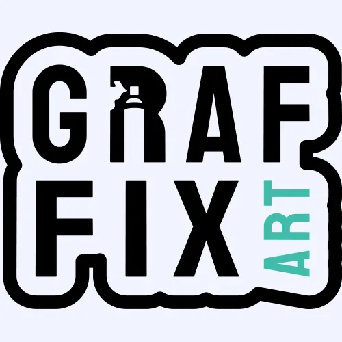
4. Typography Overhaul

The playful font from the original design got an upgrade with a clean, sans-serif typeface. It retained the circular layout for community recognition but brought a sharper, more polished feel.

Coventry Logo Design for a graffiti artist with two paint rollers crossed behind a spray can with the words graffix art around them

The Final Logo: A Modern Identity

The end result was a complete brand identity system:

  • Primary Logo: A circular badge with the spray can and rollers at its heart, perfect for merchandise, signage, and branding.
  • Secondary Logo: A horizontal version for narrower spaces.
  • Icon: A simplified spray can and rollers icon, ideal for social media profiles and small-scale uses.

This design perfectly balances the client’s artistic roots with a professional edge that sets them apart in the West Midlands graffiti scene.


Why This Project Stands Out

Revamping this graffiti logo design wasn’t about starting over—it was about building on a strong foundation. The final design retains the community recognition they’d worked hard to earn while opening doors to new opportunities and audiences.

For me, this project reinforced the importance of listening to the client’s story and respecting their roots. It’s not just about creating a logo—it’s about creating a visual identity that grows with the brand.

Disposable coffee cup with a restaurant logo featuring a stylised face with horns, printed on a textured brown background.

Let’s Work Together

Need a custom logo for your brand? Whether it’s a complete overhaul or a fresh new look, I can help you stand out.

Contact me today to start your West Midlands graffiti artist logo design!